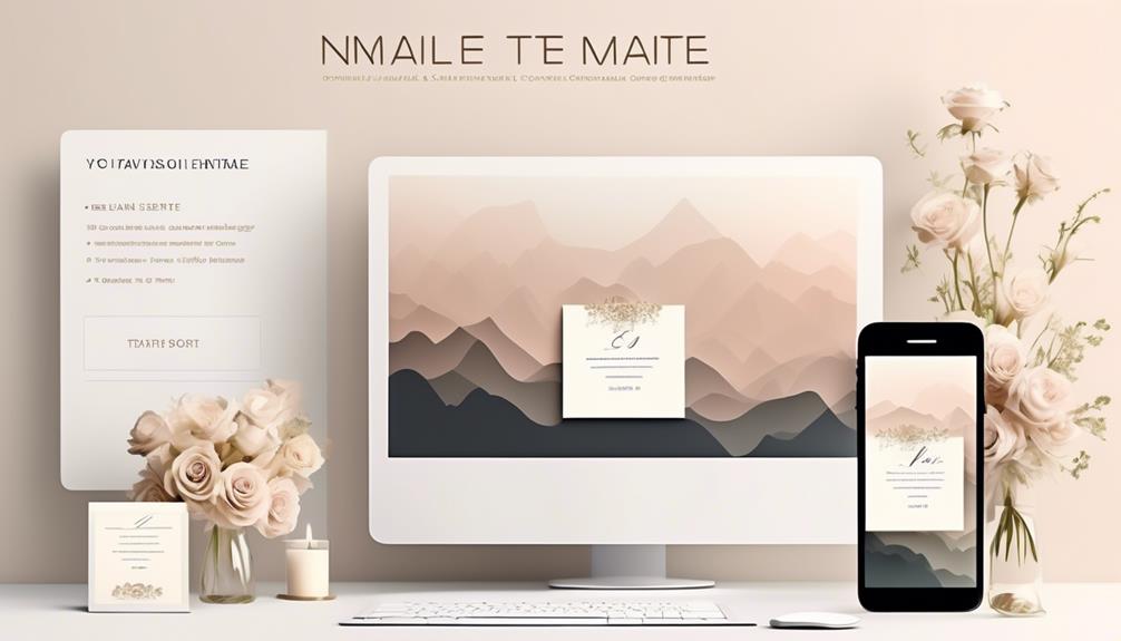
To craft engaging hero sections for your email templates, focus on establishing clear visual hierarchy by highlighting key elements like your main message and call-to-action with size, contrast, and placement. Use color strategically—trustworthy blues or urgent reds can evoke the right emotions—while keeping the layout simple and well-balanced with enough white space. Combining these techniques makes your hero stand out and guides recipients toward the desired action. Keep exploring to master creating compelling hero sections that drive results.
Key Takeaways
- Use a strong, clear headline paired with a compelling CTA to immediately convey value.
- Incorporate contrasting colors to enhance readability and draw attention to key messages.
- Maintain simplicity with ample white space to prevent clutter and focus viewer attention.
- Apply color psychology strategically to evoke desired emotions and reinforce your message.
- Arrange elements with a clear visual hierarchy to guide recipients naturally toward engagement.
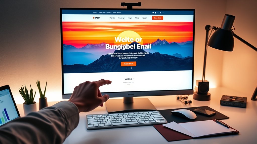
Have you ever wondered what makes a website instantly mesmerizing? The secret lies in how the visual elements are arranged and the impact they have on your viewer’s perception. When designing a hero section for an email template, mastering visual hierarchy is essential. It guides the reader’s eye naturally toward the most important information, whether that’s a compelling headline, a call-to-action (CTA), or an eye-catching image. You want to create a flow that makes it effortless for recipients to understand what you’re offering without feeling overwhelmed. To do this, you prioritize key elements through size, placement, contrast, and spacing. The largest or most vivid element typically captures attention first, then guides the eye downward or across to secondary details. This arrangement ensures the message is immediately clear and encourages engagement.
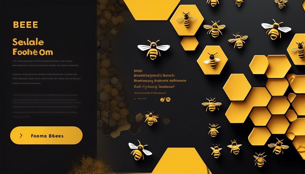
Color psychology plays a pivotal role in shaping how your hero section is perceived. Different colors evoke specific emotions and associations, influencing how your audience responds. For instance, blue often conveys trust and professionalism, making it ideal for corporate or financial content. Red can evoke excitement or urgency, perfect for limited-time offers or sales. Green is associated with growth and health, fitting for eco-friendly or wellness brands. By thoughtfully selecting your color palette, you reinforce your message and evoke desired feelings, deepening the connection with your audience. The right combination of colors can also help your CTA stand out, increasing the likelihood that recipients will click through. Consider contrast carefully; high contrast between text and background enhances readability, making your message clear even on mobile devices. Complementary colors or subtle gradients can also add visual interest without cluttering the layout.
Additionally, understanding the contrast ratio of your design elements can significantly impact how well your message is perceived and how effectively your call-to-action performs. When designing your hero section, remember that simplicity often outperforms complexity. Use visual hierarchy to highlight your main message, leading the viewer’s eye naturally where you want it to go. Employ color psychology to evoke emotions that align with your goals, whether it’s trust, excitement, or reassurance. Keep your design clean, with enough white space to prevent it from feeling crowded, which helps your audience focus on your most important elements. A well-balanced combination of visual hierarchy and color psychology ensures your email’s hero section doesn’t just look attractive but also drives action. You want your recipients to feel compelled to explore further, click your links, or make a purchase. When done right, your hero section becomes a powerful tool that captures attention instantly and guides your audience seamlessly toward your desired outcome.
Top picks for "craft engag hero"
Open Amazon search results for this keyword.
As an affiliate, we earn on qualifying purchases.
Frequently Asked Questions
How Can I Test the Effectiveness of My Hero Section?
You can test your hero section’s effectiveness by conducting A/B testing, where you compare different versions to see which performs best. Additionally, gather user feedback directly through surveys or comments to understand their reactions. By analyzing open rates, click-through rates, and engagement metrics, you’ll identify what resonates most. Combining A/B testing with user feedback gives you a clear picture of your hero section’s impact, helping you optimize it for better results.
What Are Common Mistakes to Avoid in Hero Design?
Your hero design is like a well-organized room—clutter distracts from your message. Avoid banner clutter that overwhelms viewers and makes important elements hard to find. Guarantee your call to action is clear and compelling; an unclear one confuses recipients and reduces engagement. Keep your visuals simple, focus on one main message, and make your CTA stand out. These mistakes can make your hero less effective and turn readers away.
How Do I Optimize Hero Images for Different Devices?
To optimize hero images for different devices, you should focus on responsive scaling and image compression. Use CSS media queries to adjust the size of your images based on the screen, ensuring they look great on all devices. Compress your images without losing quality to reduce load times. This way, your hero images stay crisp and fast-loading, providing a seamless experience whether your audience views your email on a phone or desktop.
What Color Schemes Work Best for Engagement?
You should choose color schemes based on color psychology to evoke emotions and drive engagement. Bright, contrasting colors grab attention, while softer tones create trust and calmness. Always maintain brand consistency to reinforce recognition. Test different schemes to see which resonates best with your audience. By combining color psychology with your brand’s palette, you’ll craft hero sections that boost engagement and strengthen your message effectively.
How Do I Personalize Hero Sections for Varied Audiences?
Think of your hero section as a tailored suit; you customize it for each audience. Use segmentation strategies to identify different groups and apply personalization tactics like dynamic content, personalized images, and targeted messaging. By understanding your audience’s preferences and behaviors, you create a hero that resonates, boosting engagement. This approach guarantees each recipient feels the message is crafted just for them, making your email stand out.
Conclusion
Just like the hero’s journey in classic tales, your email’s hero section sets the stage for adventure. By crafting a compelling headline, striking visuals, and a clear call-to-action, you guide your audience through a story they want to be part of. Remember, a well-designed hero is your Excalibur—cutting through the noise and capturing attention. With these strategies, you’ll turn your email into a legendary experience your readers won’t forget.

