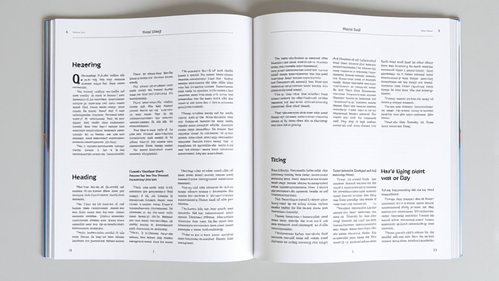
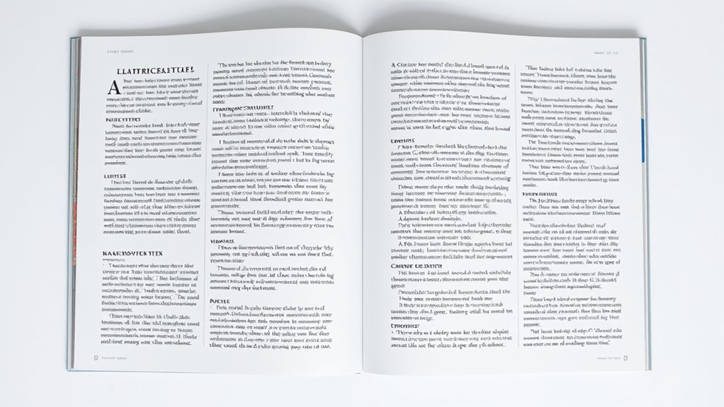
To organize your body content effectively, use clear sections with headings and subheadings to break up large blocks of text and guide your audience smoothly through your ideas. Incorporate columns for lists or comparisons to keep things visually engaging, and apply white space around your content to prevent clutter and emphasize key points. Balancing these elements creates a natural flow and keeps your layout polished—continue exploring to master these essential techniques.
Key Takeaways
- Use clear headings and subheadings to segment content into logical, easily navigable sections.
- Incorporate columns to organize related information, such as lists or comparisons, enhancing readability.
- Apply white space strategically around sections and columns to prevent clutter and improve focus.
- Establish a visual hierarchy by varying size, weight, or color to emphasize key content and guide the eye.
- Group related content cohesively to reinforce relationships and create a smooth flow throughout the layout.

Have you ever wondered how to make your body content more engaging and easy to follow? The secret lies in creating a clear visual hierarchy and effective content grouping. When your content is well-organized, readers can quickly grasp the main ideas without feeling overwhelmed. Visual hierarchy guides the eye naturally through your content, highlighting what’s most important and leading readers smoothly from one point to the next. Content grouping, on the other hand, involves organizing related pieces of information together so that they form logical units. Together, these strategies help your body content feel cohesive and accessible. Incorporating AI-powered content tools can further enhance your organization by generating suggestions for structuring your content more effectively. Start by considering how you structure your sections. Use headings and subheadings to break up large blocks of text, giving each section a clear identity. This not only improves readability but also helps establish a visual hierarchy. When headings are distinct—through size, weight, or color—they draw attention and signal shifts in topics. This way, your audience can scan your content quickly, identify relevant sections, and decide what to read first. Proper content grouping ensures these headings aren’t random but logically connected. Group related ideas, data, or steps together so that readers see the relationships and follow your flow easily. Columns can be a powerful tool to enhance your layout, especially when displaying lists, comparisons, or related information. Using columns breaks the monotony of a single wide block of text and creates visual interest. When designed thoughtfully, columns can also reinforce content grouping by visually separating different ideas while maintaining their connection. For example, placing two columns side-by-side for a comparison emphasizes their relationship, making it easier for readers to process complex information. Just be cautious: too many columns or overly narrow ones can clutter your design and hinder readability. Balance and consistency are key. White space, often overlooked, plays a crucial role in establishing a clean, organized appearance. It provides breathing room around your sections, content groups, and columns, preventing your page from feeling crowded. White space guides the reader’s eye, naturally leading them from one element to the next without confusion. It also emphasizes important content, making it stand out more effectively. When you combine white space with a clear visual hierarchy, your readers can focus on key points without distraction. Remember, less is often more—leaving enough space around your content allows your message to shine and your layout to appear polished.

SKYROVER X1 Fly More Combo, Drone with Camera 4K for Adults, 8K Photo, Under 249g, 50000ft Transmission, 96-Min Flight Time with 3 Batteries
8K Photo Excellence - SKYROVER X1 drone captures vibrant, noise-free details with its 8K photos and 4K/60fps HDR...
As an affiliate, we earn on qualifying purchases.
Frequently Asked Questions
How Do I Choose the Best Layout for My Content?
You should choose a layout that creates a clear visual hierarchy, guiding your viewers’ eyes naturally through your content. Use grid systems to maintain consistency and structure, making your design organized and easy to scan. Consider the importance of each section and allocate space accordingly. Balance columns and white space to avoid clutter, ensuring your message is delivered effectively and your layout looks professional and engaging.
What Are Common Mistakes to Avoid in Content Organization?
You might want to watch out for overloading sections, which can overwhelm your readers and dilute your message. Neglecting visual hierarchy is another subtle pitfall that makes your content harder to scan and understand. To keep your layout effective, guarantee each section is balanced, clear, and visually guided. Avoid cramming too much information and prioritize the flow, so your audience can easily follow and stay engaged with your content.
How Does Color Impact Content Readability and Organization?
Color impacts your content readability and organization by creating clear visual hierarchy through color contrast. When you choose contrasting colors, it helps important information stand out and guides your audience’s eye smoothly across the content. Using consistent colors for headings, links, and highlights improves organization, making your content easier to scan and understand. Proper color choices enhance readability and make sure your message is communicated effectively.
Can I Use Multiple Fonts Within Sections Without Clutter?
Did you know that using three or fewer fonts can improve readability by 80%? You can use multiple fonts within sections, but it’s best to maintain font consistency for clarity. To avoid clutter, establish a clear visual hierarchy by pairing fonts thoughtfully—such as a bold header font with a simple body font. This approach keeps your content organized and easy to scan, enhancing overall user experience.
How Do I Adapt Layout for Mobile Versus Desktop Screens?
To adapt your layout for mobile versus desktop screens, you need a responsive design that adjusts automatically. Use flexible grids and media queries to resize, reposition, or hide elements as needed. Prioritize touch navigation by making buttons larger and easier to tap on mobile. This guarantees a seamless experience across devices, keeping your content accessible and user-friendly whether on a phone or a desktop.

Ruko F11PRO 2 Drone with 6K Camera for Adults, 3-Axis Gimbal Stabilizer, 2 Batteries for 70-Min Flight Time, Long-Range Transmission, Auto Return & Beginner-Friendly, Ideal Tech Gift
【A Fun Tech Gift for Him】 The perfect high-value tech gift for holidays. Whether for parent-child activities or...
As an affiliate, we earn on qualifying purchases.
Conclusion
By thoughtfully arranging your body content with clear sections, balanced columns, and well-placed white space, you create a harmonious flow that guides your readers effortlessly. Remember, sometimes less is more, and subtlety can speak volumes. When you give your content room to breathe, you invite your audience to engage more deeply. So, embrace the art of gentle guidance—letting your design whisper its message—because in simplicity, there’s a quiet strength that truly resonates.

DJI Mavic 4 Pro 512GB Creator Combo with RC Pro 2, Flagship Tri-Camera Drone with 100MP 4/3 CMOS Hasselblad Camera, 51-Min Max Flight Time, Three Batteries, Charging Hub, Professional, Gray
100MP Main Camera - DJI Mavic 4 Pro’s 100MP Hasselblad camera with 6K/60fps HDR video captures stunning drone...
As an affiliate, we earn on qualifying purchases.

Potensic ATOM 2 Drone with Camera for Adults 4K Video, 8K Photo, Under 249g, 3-Axis Gimbal, 10KM Transmission, AI Track, Vertical Shooting, AI Night Shot, QuickShots, Fly More Combo (96-Min Flight)
【𝟖𝐊 𝐏𝐡𝐨𝐭𝐨, 𝟒𝐊 𝐇𝐃𝐑 𝐕𝐢𝐝𝐞𝐨】Equipped with a 1/2'' Sony CMOS sensor, it captures 𝟒𝟖𝐌𝐏 𝐩𝐡𝐨𝐭𝐨𝐬 and records 𝟒𝐊/𝟑𝟎𝐟𝐩𝐬...
As an affiliate, we earn on qualifying purchases.


