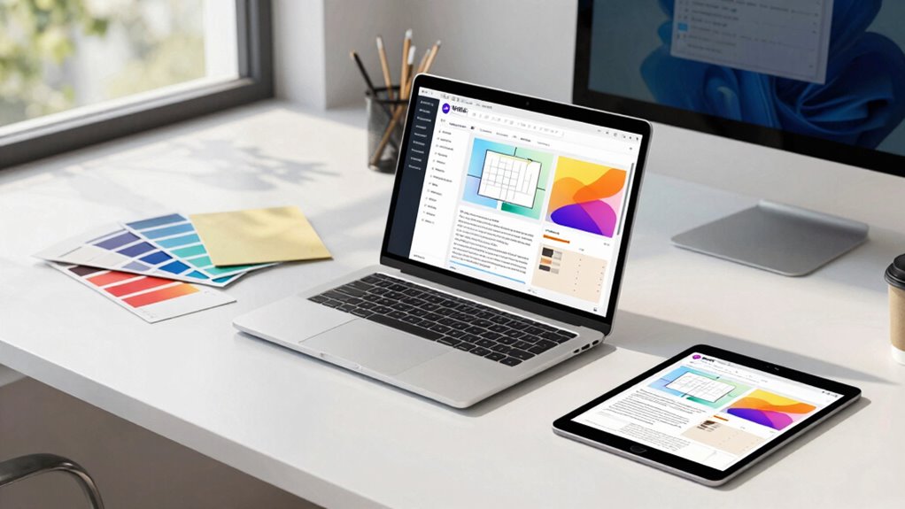

To design templates that survive client and device chaos, focus on building flexible, responsive grids that adapt gracefully to different screens and content changes. Prioritize accessibility by using semantic HTML, ensuring good contrast, and supporting keyboard navigation. Incorporate customizable modules for branding and content, allowing easy updates without layout breakage. Test thoroughly across devices and environments to identify weaknesses and refine accordingly. Keep exploring these strategies to create resilient templates that deliver consistent, professional experiences no matter the challenge.

Get business pricing on office and shipping supplies
- Business-only prices and quantity discounts
- Tax-exempt purchasing
- Multiple users, one account, clear invoices
Key Takeaways
- Implement responsive grid systems that adapt seamlessly to various screen sizes and orientations.
- Incorporate flexible, customizable modules to easily accommodate client branding and content changes.
- Prioritize accessibility standards to ensure usability across all devices and for users with impairments.
- Conduct thorough testing on multiple devices and emulators to identify and fix responsiveness issues.
- Design with resilience in mind, allowing templates to handle unpredictable client modifications and device variability.
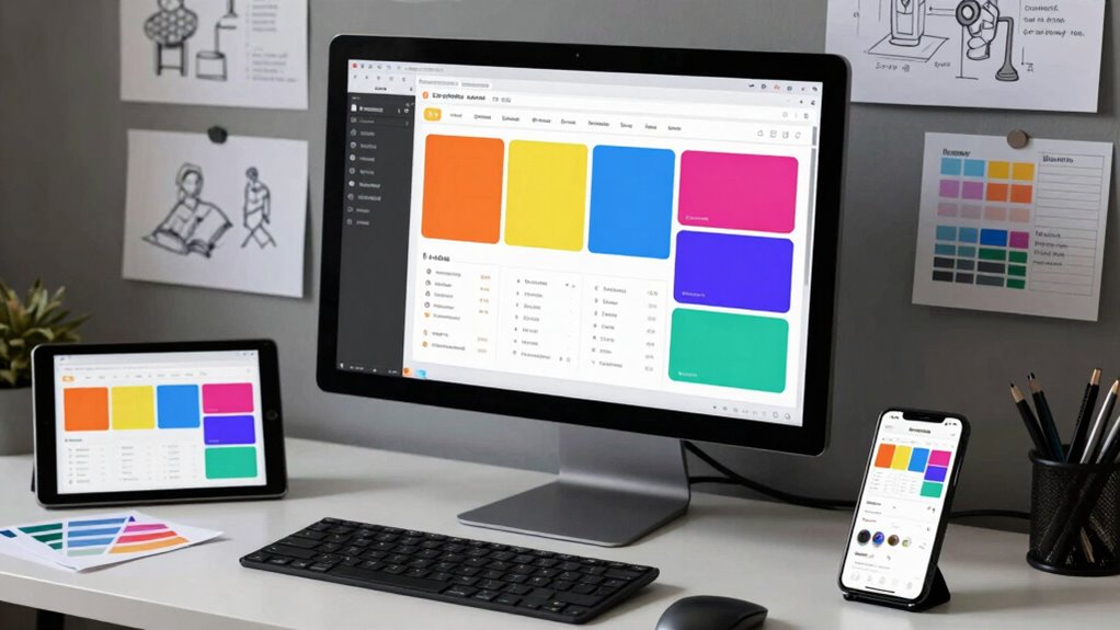
In today’s fragmented digital landscape, designing templates that can seamlessly adapt to a wide variety of client devices and configurations is more essential than ever. You need templates that are flexible enough to handle everything from small smartphones to large desktop monitors, all while maintaining a consistent, professional appearance. This is where responsive grids come into play. By leveraging responsive grids, you ensure your layout adjusts fluidly to different screen sizes and orientations, preventing elements from overlapping or becoming too cramped. This adaptability improves user experience and helps your clients feel confident that their website or app looks great everywhere.
Responsive grids ensure your templates adapt seamlessly across all devices, maintaining professionalism and enhancing user experience everywhere.
But responsiveness isn’t just about fitting screens; it’s also about following accessibility standards. When you design with accessibility in mind, you make sure your templates are usable by everyone, including those with visual, auditory, or motor impairments. This means using semantic HTML, providing sufficient color contrast, and ensuring keyboard navigation works smoothly. Incorporating accessibility standards into your design process isn’t optional—it’s a crucial step that broadens your template’s usability and demonstrates your commitment to inclusivity.
You should also consider how flexible your templates are in handling client-specific branding and content. Clients often have unique logos, color schemes, and content structures. Building in customizable modules allows your templates to adapt without breaking the layout. This modular approach complements your responsive grids, giving you the ability to swap out or resize components dynamically to suit different needs. Keep in mind that maintaining simplicity in your design reduces the risk of chaos when clients add or change content. Clear, consistent spacing, predictable grid behavior, and well-structured code help keep chaos at bay.
Testing is vital in this process. You can’t assume your templates will work perfectly across all devices and configurations without thorough testing. Use emulators and real devices to identify issues early. Pay close attention to how your responsive grids behave on various screens, and check that accessibility features function correctly in different environments. When you find issues, refine your templates to ensure they are resilient to client modifications and device variations. Additionally, understanding the importance of content adaptability can help you design templates that remain effective even as client needs evolve.
Ultimately, designing templates for client and device chaos requires a proactive approach. Focus on creating responsive grids that adapt gracefully, embed accessibility standards to widen usability, and build flexibility into your structure. When you do this, you craft templates that stand strong amidst chaos, delivering consistent, accessible experiences regardless of client preferences or device challenges.
As an affiliate, we earn on qualifying purchases.
Frequently Asked Questions
How Do I Prioritize Features for Flexible Templates?
You should prioritize features that enhance user experience and maintain visual hierarchy across devices. Focus on adaptable elements like flexible grids, responsive images, and consistent navigation. Test your templates on various devices to see which features perform best. Keep essential functionality simple and accessible, ensuring users can easily find what they need. By emphasizing these aspects, your templates will remain effective and user-friendly, despite client demands or device changes.
What Tools Best Support Responsive Template Design?
Think of your tools as a sturdy toolbox for responsive design. Use grid systems like Bootstrap or CSS Grid to create flexible layouts that adapt seamlessly across devices. Pair them with typography choices that enhance readability on any screen. These tools help you craft templates that are resilient, ensuring your design holds up no matter the chaos, like a ship’s hull, keeping your content steady and user-friendly.
How Can I Test Templates Across Multiple Devices Efficiently?
You can test templates across multiple devices efficiently by using cross-browser testing tools like BrowserStack or Sauce Labs, which simulate different devices and environments. Incorporate accessibility testing to make sure your templates are usable for everyone. Automate these tests to quickly identify issues, and switch devices often during testing to catch device-specific problems early. This approach saves time and guarantees your templates work seamlessly across all platforms.
What Are Common Pitfalls in Designing Adaptable Templates?
Think of designing adaptable templates as walking a tightrope—balance is key. Common pitfalls include neglecting template scalability, which hampers growth, and overlooking user customization, leading to rigidity. You might create a one-size-fits-all design that doesn’t accommodate diverse needs or device variations. To avoid these, prioritize flexible layouts, scalable elements, and customizable options, ensuring your templates gracefully adapt without breaking, no matter the chaos they face.
How Do I Balance Design Consistency With Device Variability?
You balance design consistency with device variability by prioritizing color harmony and typography hierarchy. Use a cohesive color palette that adapts well across screens, ensuring visual harmony. Maintain clear typography hierarchy so content remains legible and organized on any device. Test your templates on different screens, adjusting spacing and scale as needed, to keep your design consistent while accommodating diverse device sizes and resolutions.
Conclusion
In the ever-evolving landscape of clients and devices, your templates serve as the steady hand guiding users through the chaos. By embracing flexibility and anticipating change, you create a foundation that gracefully adapts to unexpected shifts. Remember, it’s not about avoiding turbulence but learning to dance amidst it. When your designs are resilient and subtle in their strength, they quietly guarantee your message endures, no matter how the environment around them shifts.
Fall Picks
fall essentials
As an affiliate, we earn on qualifying purchases.