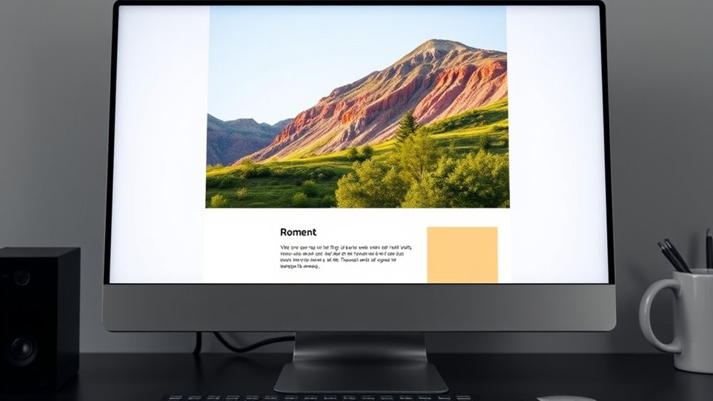
To balance text and images for that ideal 60:40 ratio, you should focus on creating a visual hierarchy that guides the eye smoothly through your content. Use high-quality images positioned near relevant text to reinforce your message, and incorporate whitespace to prevent clutter. Break up sections with headings and bullet points for better readability. Keep the overall layout clean and balanced, ensuring visuals support your message without overpowering it—continue for more useful tips.
Key Takeaways
- Prioritize high-quality images that reinforce your message while maintaining a visual-to-text ratio around 60:40.
- Position images near relevant text and key call-to-actions for seamless flow and engagement.
- Use headings, bullet points, and subheadings to break up text and support visual hierarchy.
- Incorporate whitespace around images and content to prevent clutter and enhance readability.
- Test different layouts to find the optimal balance that captures attention without overwhelming the reader.

Balancing text and images is vital for creating engaging and effective content. When designing your emails, understanding the importance of visual hierarchy guides how you arrange elements, making sure your message captures attention without overwhelming your audience. Visual hierarchy involves organizing your content so that the most critical information stands out, guiding the reader’s eye naturally through your email. Proper image placement plays a key role here; strategically positioning images enhances clarity and flow, making your message more compelling and easy to digest.
Effective email design balances visuals and text, guiding the reader naturally through a clear visual hierarchy.
To achieve this balance, start by considering the purpose of your email. Are you aiming to inform, promote, or persuade? Your goal influences how much space you dedicate to images versus text. For a 60:40 email ratio, you want around 60% of the content to be visual elements, with the remaining 40% comprising concise, impactful text. This ratio ensures your message isn’t cluttered or sparse, striking a harmony that appeals visually and functionally. When choosing images, opt for high-quality visuals that reinforce your message. Avoid cluttered or irrelevant images that could distract or confuse your audience. Instead, place images thoughtfully—near the relevant text to create a seamless flow. For instance, a product image should accompany a description or call-to-action, making it easier for recipients to connect visuals with the message.
The placement of images should also consider the natural reading pattern. Most people scan emails from top to bottom and left to right, so position key visuals near the beginning or within the main body to grab attention early. Use whitespace effectively around images to prevent the design from feeling crowded, providing visual breathing room that enhances clarity. Incorporate headings, subheadings, and bullet points to break up text, making it easier to scan alongside your images. This layered approach strengthens your visual hierarchy, emphasizing what’s most important and guiding readers effortlessly through your content. Additionally, understanding content organization can help you structure your email for maximum engagement and clarity.
Be mindful of your overall layout. A well-structured email with a clear hierarchy ensures that images and text complement each other rather than compete for attention. Too many images can overshadow your message or slow load times, while too little can make your email appear dull or text-heavy. Aim for a balance, placing images strategically to support your text, not replace it. Test different arrangements to see what resonates best with your audience. Ultimately, thoughtful image placement combined with a clear visual hierarchy helps you craft emails that are visually appealing, easy to read, and highly effective in delivering your message.
Top picks for "balanc text imag"
Open Amazon search results for this keyword.
As an affiliate, we earn on qualifying purchases.
Frequently Asked Questions
How Does Mobile Responsiveness Affect Text-Image Balance?
Mobile responsiveness impacts your text-image balance by requiring a mobile layout that adapts seamlessly to different screen sizes. You need to make sure images scale properly and don’t overpower your content, especially for touch accessibility. When designing for mobile, optimize images to load quickly and maintain clarity, so readers can easily engage with your message without frustration, ensuring a balanced, user-friendly experience across all devices.
What Are the Best Tools for Designing Balanced Emails?
You’ll want tools that truly transform your email design. Canva and Mailchimp excel at establishing visual hierarchy, ensuring your message stands out clearly. Figma and Adobe XD help you craft cohesive, brand-consistent layouts that balance text and images seamlessly. These tools enable you to fine-tune your designs, guaranteeing your emails look professional, polished, and perfectly balanced, ultimately boosting engagement and reinforcing your brand’s identity.
How Can I Optimize Images for Faster Email Loading?
To optimize images for faster email loading, start with image compression to reduce file size without sacrificing quality. Use tools like TinyPNG or JPEGoptim to streamline this process. Additionally, include descriptive alt text to improve accessibility and load times, especially if images don’t display immediately. This approach ensures your emails load quickly and remain engaging, enhancing user experience and maintaining the ideal balance between text and images.
What Metrics Indicate Successful Text-Image Balance?
You can tell your email achieves a good text-image balance by examining visual hierarchy and color contrast. If your message is clear and guides the reader smoothly, you’re on the right track. Look for metrics like click-through rates, engagement, and bounce rates—high engagement suggests effective balance. Make sure the images support the text without overwhelming it, and use contrasting colors to draw attention where needed.
Are There Industry-Specific Guidelines for Email Content Ratios?
Yes, industry standards often guide your email content ratios, but they also emphasize content customization based on your audience. You should adapt your balance of text and images to suit industry nuances, engage your readers, and meet expectations. Whether you’re in retail, B2B, or healthcare, tailoring your content guarantees relevance, boosts engagement, and maintains a professional appearance aligned with specific industry guidelines.
Conclusion
Striking the right balance between text and images isn’t just about aesthetics; it’s about connection. Too much text can overwhelm, while too many images might dilute your message. Think of your email as a conversation—sometimes, words clarify, and other times, images speak louder. When you master the 60:40 ratio, you create emails that engage and inform, proving that harmony between visuals and words isn’t just visual—it’s essential for meaningful communication.


