To create a clear hierarchy, use bold headings combined with contrast in size, weight, or color to guide your audience. Larger, bold fonts for headings signal importance and help readers easily identify key sections. Subtle size differences or contrasting styles differentiate secondary info. This approach makes your content more engaging and easy to scan, ensuring important points stand out. Keep exploring because mastering these techniques will help you craft more effective, visually appealing content.
Key Takeaways
- Use bold headings to clearly differentiate sections and signal their importance to readers.
- Vary font sizes strategically, with larger fonts for main headings and smaller for subheadings, to establish visual hierarchy.
- Apply contrast through size, weight, and color to make key content stand out and guide attention naturally.
- Ensure size differences are noticeable but harmonious to avoid visual clutter and maintain readability.
- Combine bold typography and contrast techniques to create an intuitive flow and enhance overall content comprehension.

Have you ever wondered how organizations and systems stay organized and efficient? The secret often lies in creating a clear visual hierarchy. When you design content, establishing a visual hierarchy guides your readers through the information seamlessly. It helps them understand what’s most important and where to focus their attention first. One of the most effective ways to do this is through thoughtful font sizing. By varying the sizes of your fonts, you can create a natural flow that directs the eye from headline to body text effortlessly.
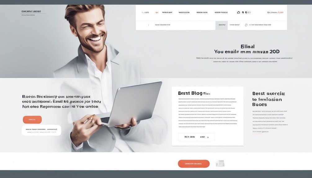
Start with your headings. Larger, bold fonts immediately signal their importance. They act as signposts that catch your reader’s eye and set the stage for what’s to come. Using a bold heading not only draws attention but also establishes a sense of structure. From there, you can use smaller font sizes for subheadings or secondary information. This contrast in size and weight creates a hierarchy that’s easy to follow, even at a quick glance. It’s like a visual roadmap that makes navigation intuitive.
When you think about font sizing, remember that it’s not just about making things bigger or smaller; it’s about creating contrast. The difference in size should be noticeable enough to distinguish levels of importance without being jarring. For example, your main title might be 36 points, your subheadings 24, and your body text 12 or 14. This gradation helps your readers identify the most critical elements at a glance and then naturally move through the content in order. Using contrast in font sizing is a simple yet powerful way to establish a hierarchy that enhances readability and comprehension.
Contrast isn’t limited to font size alone. You can also play with font weight, color, and style to reinforce the hierarchy. However, font sizing remains one of the most straightforward tools. When you get it right, your content becomes more accessible and engaging. It allows your audience to scan information quickly, pick out key points, and understand the flow of ideas without confusion. Creating a visual hierarchy through font sizing isn’t just about aesthetics; it’s about making your message clear and easy to navigate. Additionally, understanding how creative practice applies to your work can help you develop more intuitive and effective visual designs.
Top picks for "creat hierarchy bold"
Open Amazon search results for this keyword.
As an affiliate, we earn on qualifying purchases.
Frequently Asked Questions
How Do Color Choices Influence Visual Hierarchy?
Color choices influence visual hierarchy by directing your focus and creating contrast that guides your eyes through content. Using color psychology, you can highlight important sections or evoke specific emotions, making key elements stand out. Effective color contrast enhances visual flow, ensuring readers easily navigate your design. When you choose colors thoughtfully, you help users quickly understand what’s most important, improving overall readability and engagement.
What Are Common Mistakes in Using Contrast Effectively?
Like a tightrope walker, you might stumble if you ignore contrast pitfalls, causing your design to fall flat. Common mistakes include overusing contrasting colors, which creates visual clutter, or choosing too subtle differences that fail to guide the eye. These errors weaken your hierarchy, making it harder for readers to find key information. To succeed, balance contrast carefully, ensuring it highlights without overwhelming your audience.
How Can Typography Enhance Hierarchy Without Overwhelming?
Typography enhances hierarchy by carefully selecting font pairing that contrasts yet complements, guiding your readers smoothly. Use spacing techniques like increasing line height for headers and reducing it for body text to create visual separation without overwhelming. Stick to a limited font palette to maintain clarity, and balance bold headings with lighter subtext. These strategies help establish clear hierarchy, making your content inviting and easy to navigate.
What Tools Assist in Designing Hierarchy in Digital Content?
Tools like Adobe XD, Figma, and Canva help you design hierarchy in digital content. For example, using Figma, you can create visual flow and content segmentation by adjusting font sizes, weights, and spacing. These tools let you easily experiment with contrast and bold headings, ensuring your content guides readers naturally without overwhelming them. They streamline the process, making it simple to craft clear, engaging digital hierarchies.
How Does Hierarchy Impact User Experience and Readability?
Hierarchy greatly impacts your user experience and readability by guiding the visual flow, making it easier for users to find key information quickly. When you establish clear visual cues, like bold headings and contrast, you create emotional engagement that keeps users interested and focused. This intuitive structure helps prevent confusion, encourages exploration, and guarantees your content is accessible and enjoyable to navigate, ultimately improving overall satisfaction.
Conclusion
By using bold headings and contrast effectively, you guide your readers seamlessly through your content. These techniques help highlight key points and create a clear visual hierarchy, making your message more compelling. Are you ready to make your content more organized and engaging? Remember, a well-structured layout doesn’t just catch the eye—it keeps your audience engaged and enthusiastic to learn more. So, why not start implementing these strategies today and transform your writing?


