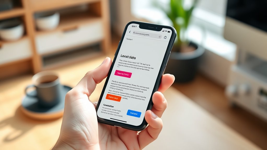
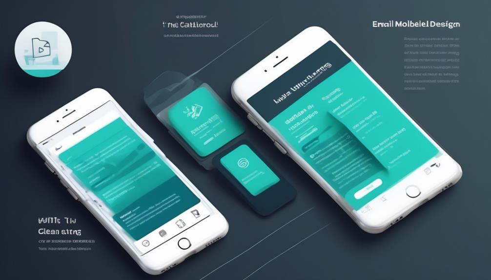
To design effective mobile-first emails, focus on using single-column layouts that adapt seamlessly to small screens. Prioritize readability with large, legible fonts, ample line spacing, and touch-friendly buttons that are at least 44 pixels in size. Clear calls to action and simplified content keep your message engaging and easy to interact with. Embracing these responsive design principles guarantees your emails look great on any device—continue to explore how you can optimize every element for maximum impact.
Key Takeaways
- Single-column layouts prioritize mobile screens, reducing clutter and improving content flow for better readability.
- Use responsive typography with larger, legible fonts and proper line spacing to enhance text clarity on small devices.
- Design buttons and calls-to-action to be touch-friendly, at least 44 pixels, with clear contrast for easy tapping.
- Ensure the layout adapts seamlessly across device sizes, maintaining content accessibility and visual consistency.
- Simplify email structure to eliminate horizontal scrolling, creating a clean, user-friendly mobile experience.

In today’s digital landscape, more people check their emails on mobile devices than ever before. This shift means your email design needs to prioritize mobile-first principles to ensure your message resonates effectively. One of the most critical aspects is opting for single-column layouts. These layouts naturally adapt to small screens, making content easier to read without requiring horizontal scrolling or zooming. When you use a single-column structure, your email remains clean and uncluttered, guiding the reader’s eye smoothly from one section to the next. This simplicity not only enhances readability but also improves engagement rates, as users are more likely to stay and interact with your content. Incorporating responsive design principles helps ensure your email adapts seamlessly across various devices and screen sizes. Responsive typography plays a crucial role in a mobile-first email design. You should choose font sizes and styles that are legible on small screens, avoiding tiny text that forces users to pinch and zoom. With responsive typography, your text scales appropriately across all devices, maintaining clarity without sacrificing style. Use larger, easy-to-read fonts for headings and body text, and ensure there’s sufficient line spacing to prevent the content from feeling cramped. When your typography adapts seamlessly to different screen sizes, your message becomes accessible to everyone, regardless of the device they’re using. Touch-friendly buttons are another essential element in mobile-first email design. Since most users navigate with their fingers, buttons need to be large enough and spaced adequately to prevent accidental clicks. Aim for buttons at least 44 pixels in height and width, with enough padding around them to make tapping comfortable. Clear, concise calls to action (CTAs) are crucial—use contrasting colors and straightforward copy so users immediately understand what to do next. Incorporating touch-friendly buttons not only improves usability but also increases click-through rates, as users find it easier to interact with your content without frustration.

Elgato Prompter – Teleprompter with Built-in Screen for YouTube, Twitch, Zoom and More, 1080 pixels, Supports DSLR/Webcam/Smartphone, Drag & Drop Monitor Display, Works with Mac/PC & Stream Deck
Built-in display, Drag-and-drop: No extra tablets or smartphone screens required. Move any window or app onto Prompter’s display,...
As an affiliate, we earn on qualifying purchases.
Frequently Asked Questions
How Do I Test Email Readability Across Different Mobile Devices?
Think of testing your email as a chef tasting their dish on different plates. You’ll want to check how your email looks on various devices by using tools like Litmus or Email on Acid. Focus on responsive fonts that scale smoothly and guarantee touch targets are large enough to tap comfortably. This way, you guarantee your email remains clear, readable, and user-friendly, no matter which mobile device your audience uses.
What Are the Best Tools for Creating Single-Column Email Layouts?
You should explore responsive frameworks like Foundation or MJML, which make creating single-column email layouts easier. Additionally, use drag-and-drop builders such as Mailchimp or Campaign Monitor, as they simplify designing mobile-friendly, single-column layouts without coding. These tools help guarantee your emails are responsive and readable on all devices, streamlining the process and improving your email marketing effectiveness.
How Can I Optimize Images for Faster Mobile Email Loading?
Think of your images as messages that need to reach your audience swiftly. To optimize, you should use image compression to reduce file sizes without losing quality, making your emails load faster. Additionally, employ Retina optimization to guarantee images look sharp on high-resolution screens. This way, your visuals stay engaging and accessible, delivering your message effectively and creating a seamless experience for every mobile user.
What Are Common Mistakes to Avoid in Mobile-First Email Design?
You should avoid inconsistent design elements that break the flow, as they can confuse your readers. Don’t neglect font scalability; small or overly elaborate fonts hinder readability on mobile screens. Maintain design consistency across your email to guarantee a seamless experience. Also, avoid cluttered layouts—stick to a clean, single-column structure that adapts well. These mistakes can reduce engagement, so prioritize clear, scalable fonts and cohesive design to enhance mobile readability.
How Does Mobile-First Design Impact Overall Email Marketing Performance?
Mobile-first design boosts your email marketing performance by enhancing user engagement and increasing click-through rates. When your emails are optimized for mobile, recipients find them easier to read and navigate, encouraging interaction. This seamless experience keeps users interested and more likely to click links. As a result, you see better campaign results, higher conversions, and improved overall ROI, making mobile-first design essential for your email marketing success.

Geimrsy i2/12-inch professional teleprompter, tempered optical glass, all-metal structure, equipped with remote control and dedicated app, compatible with a wide range of devices
Teleprompter adopts the design of liftable structure, according to the different devices and shooting needs to flexibly adjust...
As an affiliate, we earn on qualifying purchases.
Conclusion
As you embrace mobile-first email design, you’ll find your messages fitting perfectly into every inbox, like a well-tailored suit. Single-column layouts and clear readability turn recipients’ screens into welcoming spaces, making your content feel personal and effortless. It’s no coincidence—when your emails adapt seamlessly, your audience feels connected and valued. So, trust the process, and watch how your messages bloom across screens, turning digital spaces into inviting, familiar places.

Glide Gear TMP 100 Teleprompter – DSLR, Tablet, Smartphone – 12" Glass, Carry Case, No Assembly
WIDE DEVICE COMPATIBILITY: The TMP 100 Teleprompter is Designed to Accommodate Smartphones and Tablets up to 10.5"x 8",...
As an affiliate, we earn on qualifying purchases.

NEEWER Basics X12B Aluminum Alloy Teleprompter 12" for iPad Tablet DSLR Camera, Bluetooth, No Assembly, Remote & App Control, Compatible with iOS Android, Black, for Streaming
【Introducing NEEWER BASICS】 Simple and practical, NEEWER BASICS is an economical product line that focuses on essential functions...
As an affiliate, we earn on qualifying purchases.


