
Most email layouts try to do too much at once because designers often believe more content increases engagement. They overload the email with multiple images, links, and messages, thinking it will appeal to everyone. However, this creates clutter that overwhelms you and makes it hard to focus on the main point. If you want to improve your email effectiveness, understanding how to simplify and organize your layout can make a big difference. Keep going to learn more.
Key Takeaways
- Designers often overload emails to include all information, aiming to maximize value in a single message.
- Lack of understanding about visual hierarchy causes multiple elements to compete for attention.
- Fear of missing important details leads to cluttered layouts that try to serve multiple purposes simultaneously.
- Insufficient focus on core message prompts inclusion of excessive content and visuals.
- Limited awareness of clutter reduction strategies results in crowded designs that overwhelm recipients.
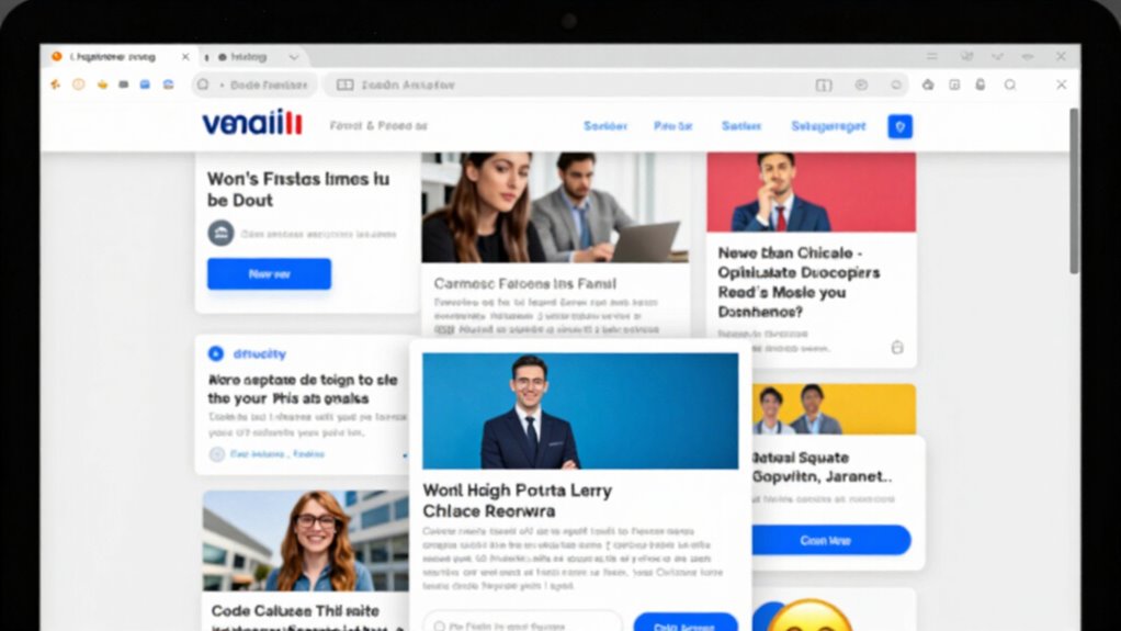
Have you ever received an email that feels cluttered and overwhelming? It’s a common experience, and it often happens because the layout tries to do too much at once. When every element is competing for attention, your eyes don’t know where to focus, making the email feel chaotic and hard to digest. That’s where understanding visual hierarchy comes into play. By establishing a clear visual hierarchy, you guide your recipient’s eye through the message in a natural, logical order. This means highlighting the most important information first, then supporting details, and finally, calls to action. When you do this effectively, your email becomes easier to scan and understand, reducing the mental load on your reader. Recognizing the importance of content organization can help you craft layouts that communicate your message more effectively. Additionally, paying attention to design principles ensures that each element serves a purpose and contributes to a cohesive message.
A clear visual hierarchy guides the reader smoothly through your email, making key points stand out effortlessly.
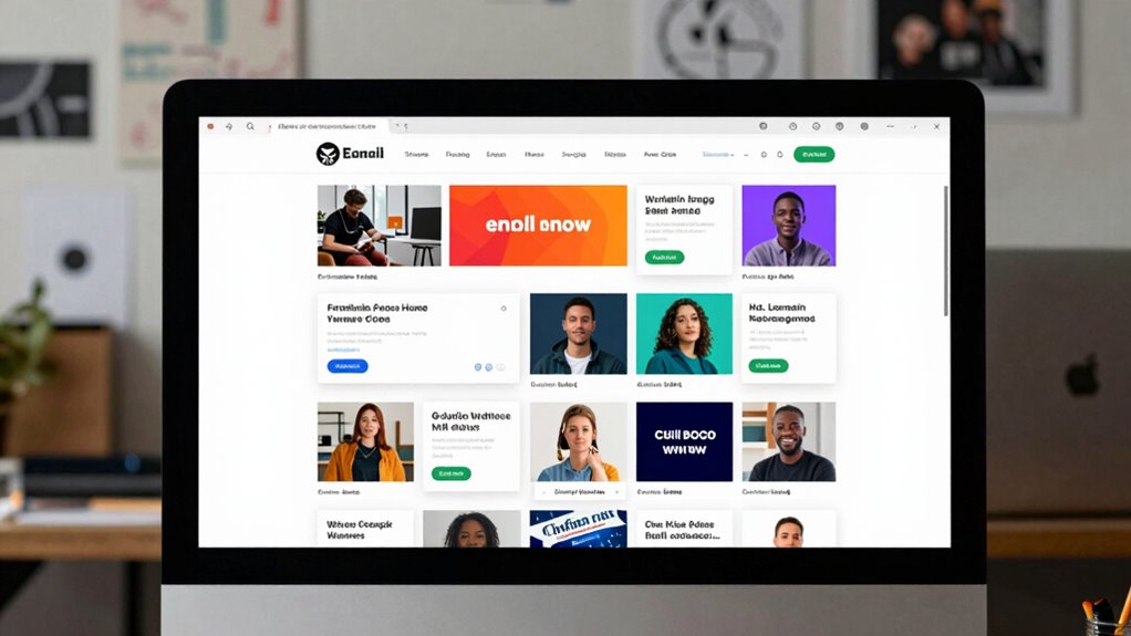
Clutter reduction is another crucial aspect of creating effective email layouts. Many designs try to cram in multiple images, text blocks, buttons, and links, which can overwhelm the reader and dilute your message. When an email is cluttered, your audience might miss key points or feel frustrated trying to navigate through the disorganized content. To avoid this, you need to strip your layout down to its essentials. Focus on a clean, simple design with plenty of white space to separate different sections. This not only makes your email more visually appealing but also allows your message to stand out clearly. Clutter reduction helps your audience quickly grasp what you’re offering without feeling bombarded or distracted.
Most email layouts attempt to do too much because designers often think more is better—more images, more links, more information. However, this approach can backfire, leading to emails that are visually noisy and difficult to process. Instead, you should prioritize clarity and purpose. Decide what the main goal of your email is—whether it’s to inform, promote, or invite—and then organize your layout around that goal. Use a consistent structure, with a prominent headline, a concise body, and a strong call to action. This focused approach keeps your message direct and effective, reducing the temptation to add unnecessary elements that clutter the design.
In essence, successful email layouts aren’t about fitting everything into one space; they’re about thoughtfully organizing what’s there. By emphasizing visual hierarchy and practicing clutter reduction, you make your emails more engaging, easier to read, and ultimately more effective. When you strip away the distractions and guide your audience’s attention, you create a seamless experience that encourages them to take action rather than feel overwhelmed by chaos.

11PCS Geometric Drawings Templates, Drafting Stencils Measuring Tools, Transparent Green Plastic Ruler, for Architecture, Office, Studying, Designing
- High-Quality Durable Plastic: Made from lightweight, sturdy plastic
- Complete 11-Piece Set: Includes various templates for diverse needs
- Versatile Application: Suitable for art, architecture, and education
As an affiliate, we earn on qualifying purchases.
As an affiliate, we earn on qualifying purchases.
Frequently Asked Questions
How Does Clutter Affect Email Engagement Rates?
Clutter in your email causes visual overload, making it hard for recipients to focus on key messages. This overload leads to cognitive fatigue, reducing engagement rates because readers feel overwhelmed and may ignore or delete your email. When your layout is too busy, your audience struggles to process information quickly, decreasing click-throughs and conversions. Simplifying your design helps your message stand out, encouraging more engagement and better results.
What Are the Best Practices for Simplifying Email Designs?
Imagine a clear, focused pathway guiding your eye—this is what a minimalist approach achieves in email design. Keep your layout simple, emphasizing a strong visual hierarchy with contrasting colors and clear headings. Limit content to essentials, use whitespace effectively, and prioritize key messages. This way, your recipients can easily scan, understand, and engage without feeling overwhelmed, boosting your email’s effectiveness and response rates.
How Can Segmentation Improve Email Layout Effectiveness?
Segmentation improves email layout effectiveness by allowing you to implement personalization strategies tailored to specific audience groups. When you target segments with relevant content, your emails become more engaging and less cluttered, focusing on what matters most. The benefits are clear: higher open rates, click-throughs, and conversions. You’ll deliver a more personalized experience, making your audience feel understood and valued, which ultimately boosts your email campaign success.
What Are Common Design Mistakes in Complex Emails?
You often make the mistake of overcrowding your complex emails, ignoring visual hierarchy and color harmony. When too much info competes for attention, recipients get overwhelmed and disengage. Failing to prioritize key messages causes confusion, while poor color choices disrupt readability. To prevent this, establish a clear visual hierarchy, use harmonious colors to guide the eye, and keep your layout simple and focused. This approach improves engagement and ensures your message lands effectively.
How Does Mobile Responsiveness Impact Email Layout Choices?
Ironically, in the age of mobile dominance, ignoring mobile responsiveness is like ignoring a billboard in Times Square. You need mobile optimization and responsive design to guarantee your email adapts seamlessly across devices. When you prioritize these, your layout becomes user-friendly and engaging on smartphones and tablets, increasing your chances of catching attention. Without this focus, your message risks getting lost or unread, defeating the purpose altogether.
Conclusion
So, steer clear of cluttered chaos by simplifying your style. Focus on a single message, streamline your layout, and make your email easier to engage with. Remember, less is more—less clutter, less confusion, and more clarity. Keep your design disciplined and deliberate, delivering your message with precision and punch. When you pare it down and prioritize, your email will not only look better but also boost your brand’s brilliance and build better bonds.