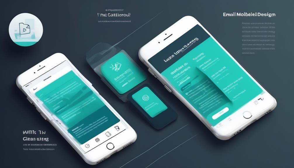
As marketing professionals, we all understand the importance of creating mobile-friendly emails. But do we truly comprehend the essential tips and proven strategies to boost the effectiveness of our email campaigns on mobile devices?
It's not just about making sure the email is visible on a smaller screen. It's about optimizing the entire user experience to drive engagement and conversions.
With the ever-increasing number of mobile users, mastering mobile-friendly email design is essential for achieving marketing success.
So, what are the top design tips that can make a real difference in our email marketing efforts? Let's explore the strategies that can elevate our mobile email campaigns to the next level and ensure they resonate with our audience in a meaningful way.
Key Takeaways
- Mobile-friendly email design is crucial for successful email marketing as a significant percentage of email opens occur on mobile devices.
- Using a single-column layout in emails ensures readability and adaptability to different screen sizes.
- Prioritizing readability and clarity on mobile devices by incorporating white space, clear headings, and optimized images can improve email engagement.
- Simplifying email design through legible fonts, prominent call-to-action buttons, ample white space, and consistent display testing across devices can enhance the effectiveness of mobile-friendly emails.
Importance of Mobile-Friendly Email Design
Mobile-friendly email design is crucial for reaching a wide audience and ensuring a positive user experience. With the majority of people accessing their emails on a mobile device, it's essential to prioritize mobile-friendly emails. Responsive emails that adapt to various screen sizes and devices are key to engaging recipients and preventing them from getting frustrated with poorly designed emails.
When emails aren't optimized for mobile, users may encounter issues such as text that's too small to read, images that don't load properly, or calls to action that are difficult to tap. These issues can lead to a negative user experience and may cause recipients to disregard or delete the email altogether.
Scalable Design for Mobile Emails
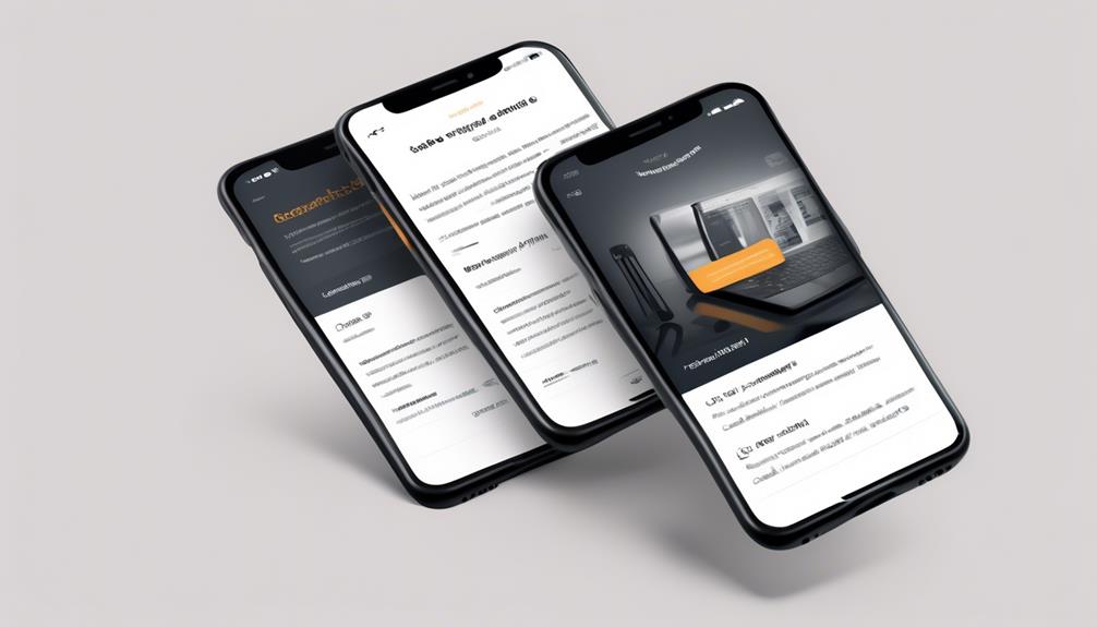
When it comes to scalable design for mobile emails, font size and image optimization are crucial factors.
Ensuring that the font size is easily readable on smaller screens and optimizing images for quick loading are essential for a seamless mobile experience.
Font Size
Adapting font sizes for mobile emails requires careful consideration to ensure optimal readability and a consistent reading experience across different devices. When designing mobile-friendly emails, it's crucial to prioritize font size to cater to the needs of mobile users. Using a font size of at least 14 pixels for body text enhances legibility on mobile devices, contributing to a better user experience. It's also essential to ensure that the font size is scalable, allowing it to adapt to various screen sizes for a consistent reading experience. Testing font sizes across different devices and email clients is crucial to guarantee optimal readability. Additionally, increasing line spacing can further improve the readability of mobile-friendly email content.
| Font Size | Importance |
|---|---|
| At least 14 pixels | Improves legibility on mobile devices |
| Scalable | Ensures consistent reading experience |
| Testing | Crucial for optimal readability across devices |
Image Optimization
After prioritizing font size for optimal readability in mobile emails, the next focus is on image optimization for scalable design, ensuring a seamless viewing experience across various screen sizes. When optimizing images for mobile-friendly email design, we consider the following:
- Implementing scalable design principles, such as grid systems and single-column layouts
- Utilizing fluid design techniques to adapt to different mobile screen sizes
- Leveraging responsive design with CSS media queries for optimal adaptability
- Ensuring images scale properly with mobile screen widths to avoid distortion
- Prioritizing image optimization to enhance mobile user experience and improve email load times
Fluid Design for Mobile Emails
Implementing fluid design in mobile email layout allows for seamless adaptation to various screen sizes, ensuring a consistent and optimized viewing experience across different devices.
Fluid design uses percent-based sizing to dynamically adjust email content to fit the dimensions of mobile screens. This approach is crucial for mobile-friendly email design as it enables emails to maintain their format and layout regardless of the screen size or orientation.
By incorporating fluid design, marketers can ensure that their emails are responsive and visually appealing on a wide range of mobile devices.
Additionally, fluid design allows for the effective utilization of white space, creating a cleaner and more organized layout that enhances the overall user experience.
When crafting subject lines and designing email content, marketers should consider the importance of fluid design in ensuring that their messages are effectively delivered and displayed on mobile devices.
Ultimately, fluid design is an essential aspect of mobile-friendly email design, as it enables marketers to create emails that are visually engaging and functional across diverse mobile platforms.
Responsive Design for Mobile Emails

As we shift our focus to responsive design for mobile emails, we're looking at the crucial elements of layout for small screens, font size adjustments, and image optimization.
These aspects ensure that our emails aren't only visually appealing but also functional across various devices and screen sizes.
Layout for Small Screens
To ensure optimal readability and compatibility across various email clients on small screens, a single-column layout is recommended for mobile-friendly email design. When designing for the mobile version, it's essential to consider the following:
- Properly sizing and scaling images for different screen resolutions
- Keeping call-to-action buttons front and center with clear, action-oriented language
- Using contrasting colors to improve clickability
- Optimizing font size and spacing for enhanced legibility
- Testing email designs across multiple devices and email clients
Font Size Adjustments
We can incorporate CSS media queries to dynamically adjust the font size, ensuring optimal readability on a variety of mobile devices. It's important to consider the screen size and resolution of mobile devices, as larger fonts may be necessary for improved legibility.
For body text, a font size of at least 14 pixels is recommended to enhance readability on smaller screens. Additionally, increasing the font size for headlines and important details can make them more prominent and easily noticeable on mobile screens.
It's crucial to test font size adjustments across a range of devices and email clients to ensure compatibility and effectiveness. Responsive design allows for flexible font size adjustments, ensuring that mobile-friendly email designs cater to diverse mobile devices and screen sizes.
Image Optimization
Utilizing responsive design is essential for optimizing images in mobile emails, ensuring seamless adaptation to various screen sizes and orientations. When it comes to image optimization for mobile-friendly emails, consider the following key strategies:
- Optimize image sizes and formats to reduce load times
- Implement CSS media queries to adjust image layout, size, and resolution
- Use alt text for images to provide context and convey the message
- Test image rendering and placement across multiple devices and email clients
- Ensure quick rendering on mobile devices
Subject Line and Preheader Character Limit
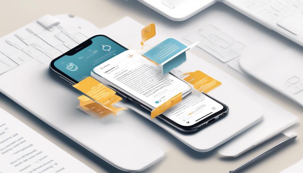
Keeping subject lines concise and preheader text informative is crucial for optimizing mobile-friendly email design. In today's fast-paced digital world, attention spans are shorter, especially on mobile devices. It's essential to capture the recipient's attention quickly and efficiently.
According to industry best practices, subject lines should ideally be kept within 25-30 characters for maximum impact on mobile screens. This brevity ensures that the subject line is fully visible and compelling. Additionally, utilizing preheader text effectively can provide valuable context and further support the subject line within the 40-130 character limit. This presents an opportunity to offer a glimpse of the email content, enticing recipients to open the email.
When crafting subject lines and preheader text for mobile-friendly email marketing campaigns, one must consider the limited space and the need to convey the message concisely. By adhering to these character limits and optimizing the content for mobile devices, marketers can enhance the effectiveness of their email campaigns and improve engagement with their audience.
Single-Column Layout Advantage
When it comes to mobile-friendly email design, the single-column layout offers significant advantages.
It ensures that our emails are easily readable and clear on mobile devices.
This layout simplifies the user experience and emphasizes the importance of responsive design for better interaction.
Responsive Design Importance
Using a single-column layout in email design enhances readability and ensures compatibility across various email clients and mobile devices. When it comes to creating mobile-friendly emails, responsive design and a single-column layout play a crucial role.
Here's why a single-column layout is advantageous for mobile responsive emails:
- It helps in creating mobile-friendly emails that adapt well to different screen sizes.
- The single-column layout ensures that the email content remains clear and accessible on various devices.
- By opting for a single-column layout, you can enhance the overall responsiveness of the email design.
- It enables the creation of scalable emails that adjust seamlessly to different mobile screens.
- A single-column layout simplifies the design, making it easier for users to navigate and engage with the email content.
Readability and Clarity
To enhance readability and clarity on mobile devices, we prioritize utilizing a single-column layout in email design. This layout ensures that content is displayed in a linear, easy-to-read format, eliminating the need for users to zoom in or scroll horizontally.
By incorporating ample white space and left-aligning the text, we improve legibility and make it easier for recipients to consume the email's content on their mobile devices.
Clear and concise headings, subheadings, and bullet points further enhance scanning and comprehension, catering to the typical behavior of mobile users.
Additionally, optimizing images for quick loading and using descriptive alt text contribute to a seamless mobile experience.
These design considerations, combined with well-crafted subject lines and strategic placement of call-to-action buttons, enhance the overall readability and effectiveness of mobile-friendly email designs.
Simplicity for Mobile
Embracing a single-column layout in email design enhances compatibility and readability across various email clients and mobile devices.
When optimizing for mobile-friendliness, simplicity is key. Here are some tips for creating mobile-friendly email designs:
- Opt for bigger fonts and left-align email copy to enhance legibility on mobile screens.
- Use clear and prominent call-to-action buttons for easy tapping on mobile devices.
- Incorporate ample white space around elements and paragraphs to improve navigation on smaller screens.
- Test your emails across multiple devices and email clients to ensure consistent display.
- Craft concise and compelling subject lines for marketing emails to capture mobile users' attention.
Importance of Larger Elements
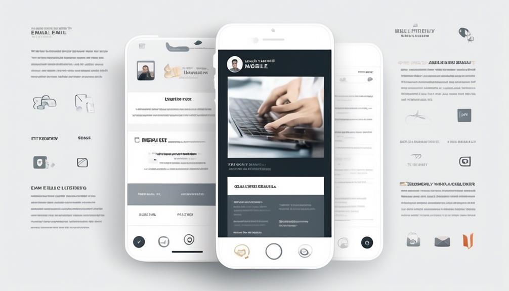
Implementing larger elements in mobile email design is crucial for improving readability and enhancing user experience on smaller screens. By using larger fonts, images, and buttons, marketers can create visually appealing and easily accessible content for mobile users. A single-column layout with larger elements not only simplifies the design but also ensures that the email is optimized for various mobile devices. This approach helps in maintaining a clean and uncluttered appearance while prioritizing the most important information. In particular, the call-to-action (CTA) buttons should be prominent and easily clickable, with concise language that compels recipients to take action. Larger CTA buttons can significantly improve click-through rates and drive conversions on mobile devices. Testing the performance of larger elements across different devices is essential to guarantee a seamless user experience and to optimize open rates. By prioritizing larger elements in mobile-friendly email design, marketers can effectively capture the attention of recipients and improve overall engagement.
| Mobile-Friendly Email Design Tips | |
|---|---|
| Importance of Larger Elements | Marketers should prioritize larger fonts, images, and CTA buttons to enhance readability and user experience on smaller screens. |
| Single-Column Layout | Implementing a single-column layout with larger elements helps in creating a clean and uncluttered design for mobile-friendly emails. |
| CTA Buttons | Larger call-to-action buttons with clear and concise language are essential for driving conversions on mobile devices. |
| Testing and Analysis | Testing the performance of larger elements across multiple devices is important for ensuring a seamless user experience and optimizing open rates. |
| Visual Appeal | Using larger elements in mobile email design can enhance visual appeal and make it easier for mobile users to interact with the email content. |
Left Alignment for Better Readability
Utilizing left alignment in email copy significantly enhances readability and creates a smoother reading experience for mobile users. When it comes to email design, left alignment plays a crucial role in optimizing the readability and user-friendliness of your content, especially for mobile audiences. Here are five reasons why left alignment is essential for better readability and a mobile-friendly email design:
- Improved Readability: Left-aligning email copy reduces eye strain and makes it easier for users to scan through content, enhancing overall readability.
- Consistent Visual Flow: By maintaining a left-aligned format, you can create a consistent and organized visual flow within the email, improving the user experience.
- Optimized White Space: Left alignment helps in optimizing white space, preventing overcrowding and enhancing the visual appeal of the email.
- Enhanced User Experience: Implementing left alignment in your email design can significantly enhance the overall user experience, making it more engaging for recipients.
- Increased Engagement: A well-aligned email with enhanced readability is more likely to capture and retain the attention of mobile users, increasing engagement with the content.
Incorporating left alignment in email design is a simple yet powerful way to ensure that your content is easily digestible and visually appealing for mobile users.
Navigation Bar Considerations
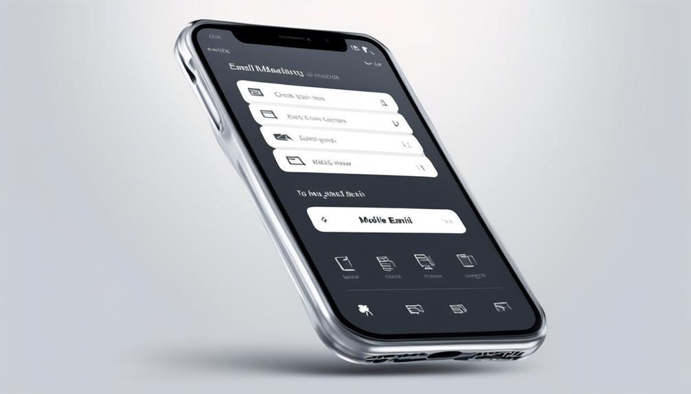
When it comes to crafting a mobile-friendly email design, the navigation bar is crucial for guiding recipients through the content.
We aim to prioritize a clear menu structure and minimalistic navigation icons to enhance user experience on mobile devices.
Clear Menu Structure
To create a clear menu structure in mobile-friendly email design, prioritize using a single-column layout to enhance readability and compatibility across various email clients. This layout ensures that the menu structure remains clear and easily navigable for recipients using different devices and email clients.
In addition to the single-column layout, clear and concise headings, subheadings, and bullet points play a crucial role in guiding the reader through the email content.
Optimizing images for quick loading and proper scaling on mobile screens is essential to maintain a clear menu structure. Placing prominent and easily clickable call-to-action buttons near the top of the email further facilitates easy navigation.
It's also important to test emails across multiple devices and email clients to ensure the navigation bar and menu structure are clear and functional.
- Use a single-column layout for enhanced compatibility
- Ensure clear and concise headings, subheadings, and bullet points
- Optimize images for quick loading and proper scaling on mobile screens
- Place prominent and easily clickable call-to-action buttons near the top of the email
- Test emails across multiple devices and email clients
Minimalistic Navigation Icons
In crafting a mobile-friendly email with a clear menu structure, the consideration of minimalistic navigation icons becomes pivotal for optimizing readability and user experience. By using minimalistic navigation icons, clutter is reduced, and readability in the navigation bar of mobile-friendly emails is improved. This ensures that the essential navigation items are prioritized, contributing to a streamlined mobile experience. It's important to avoid overcrowding the navigation bar, maintaining a clean and uncluttered design. Additionally, ensuring white space around links and making navigation icons easy to tap and distinguishable enhances mobile interaction and ease of navigation. Testing the functionality and visibility of navigation icons across different mobile devices and email clients is crucial for consistent usability and improved email opens.
| Considerations | Description |
|---|---|
| Minimalistic Icons | Reduce clutter and improve readability in the navigation bar of mobile-friendly emails |
| White Space around Links | Ensure easy tapping and distinguishability of navigation icons for enhanced mobile interaction and ease of navigation |
| Responsive Email Design | Test functionality and visibility across different mobile devices and email clients for consistent usability |
Optimal White Space in Emails
Enhancing mobile email readability and navigation through optimal white space is essential for improving user experience.
When it comes to email design, incorporating adequate white space is crucial for mobile-friendly email marketing.
Here are some best practices for utilizing white space effectively:
- Use white space around elements, images, and paragraphs to improve visual appeal.
- Ensure sufficient white space around call-to-action buttons and links for easy tapping on mobile devices.
- Create a clean and uncluttered layout by incorporating white space, preventing overwhelming the user.
- Embrace white space to contribute to a modern and minimalist email design, enhancing the overall user experience.
- Experiment with different white space configurations to find the optimal balance for readability and visual impact.
Email Load Time Optimization
By optimizing email load time, we can enhance the overall user experience and ensure efficient delivery of content to recipients. To achieve this, it's crucial to focus on email design, responsiveness, and the optimization of subject lines and preheaders. One effective way to optimize email load time is by keeping the email code light and compressing large-size images. Additionally, using alt text allows the message to be conveyed even when images are disabled, making the email more accessible. It's also important to ensure that email buttons are distinguishable and clear in their call-to-action, with a larger size and clear indications of clickability. Moreover, optimizing images to scale properly with the mobile screen width and maintaining correct proportions is essential for faster email load times. Lastly, thorough testing across multiple devices is necessary to guarantee consistent and optimized load times. The table below summarizes key strategies for optimizing email load time:
| Strategies | Benefits |
|---|---|
| Optimize email code | Lighter code for faster load times |
| Compress images | Reduces file sizes for quicker loading |
| Use alt text for images | Ensures accessibility and message delivery |
| Distinguish email buttons | Clear call-to-action for improved engagement |
| Test across multiple devices | Ensures consistent and optimized load times |
Alt Text for Images
To ensure an inclusive email experience, we incorporate alt text for images, allowing for seamless message delivery even when images are disabled. Alt text is a crucial element of mobile-friendly email design, and it plays a vital role in ensuring that your emails are accessible and informative, regardless of the recipient's ability to view images.
Here are some essential tips for optimizing alt text in your email marketing:
- Be descriptive: Use clear and concise language to describe the content or purpose of the image.
- Keep it concise: Aim for a brief alt text that conveys the essential information without being too lengthy.
- Avoid keyword stuffing: While it's important to include relevant keywords, avoid overloading your alt text with excessive keywords.
- Use punctuation sparingly: In most cases, it's best to avoid using punctuation marks in alt text unless necessary for clarity.
- Test for effectiveness: Always test how your alt text appears in different email clients and devices to ensure it enhances the overall user experience.
Incorporating these alt text best practices won't only improve the accessibility of your emails but also contribute to a more effective and inclusive email marketing strategy.
Effective Button Design
Designing buttons with clear indications, prominent placement, and action-oriented language encourages clicks and enhances user engagement. In email marketing, the design of call-to-action (CTA) buttons plays a crucial role in driving conversions.
To optimize the effectiveness of CTAs in mobile-friendly emails, it's essential to consider several key factors. Firstly, ensure that the buttons are of optimal size, at least 44 x 44 pixels, to facilitate easy tapping on mobile devices. Additionally, using contrasting colors for the buttons can draw attention and make them stand out within the email layout.
Strategic placement near the top of the email can quickly capture the attention of busy, on-the-go readers. Furthermore, testing and analyzing the responsiveness and functionality of the buttons on different devices is vital for optimizing their performance.
Importance of Thorough Testing
Thorough testing of mobile-friendly email designs ensures that the buttons designed for optimal size and placement effectively capture the attention of busy, on-the-go readers. The importance of thorough testing in email design can't be overstated, particularly in the context of mobile responsiveness. Here are the key reasons why thorough testing is crucial:
- Ensuring proper display and functionality across diverse mobile devices and email clients.
- Identifying and addressing rendering issues, broken elements, and compatibility problems specific to mobile devices.
- Testing the responsiveness and functionality of call-to-action buttons, images, and layout on different mobile screens.
- Optimizing user experience, engagement, and conversion rates through meticulous testing.
- Delivering a consistent and effective mobile email experience by testing across multiple devices and email clients.
Thorough testing is the linchpin of successful mobile-friendly email design. It not only guarantees that emails are visually appealing and functional across various platforms but also plays a pivotal role in enhancing user interaction and response rates. Marketers must prioritize comprehensive testing to ensure that their emails are optimized for mobile viewing and engagement.
What Are the Best Practices for Mobile-Friendly Email Design for Marketers?
When it comes to creating effective mobile-friendly email design, the key tips mobile-friendly email design for marketers are to use simple and responsive layouts, optimize images for quick loading, use large, tappable buttons, and ensure legible font sizes. Testing the design on various devices is also crucial for a seamless user experience.
Frequently Asked Questions
How Do You Format an Email so It Looks Good on Mobile?
We format emails to look good on mobile by using a single-column layout for better compatibility and readability.
We optimize images for quick loading and use clear call-to-action buttons with action-oriented language and contrasting colors.
Keeping subject lines and preheader text within character limits avoids clipping and improves open rates.
Testing and analyzing email performance across devices helps us make data-driven improvements for mobile-friendly designs.
How Do I Make an Email Template Mobile Friendly?
We make an email template mobile friendly by using a single-column layout for better compatibility and readability on smaller screens.
We aim for larger fonts to enhance legibility and place call-to-action buttons near the top, ensuring easy clicking.
Our images scale properly and include alt text for accessibility.
We rigorously test across devices and email clients for a consistent user experience.
What Is an Appropriate Layout for an Email Being Optimized for Mobile?
We found that a single-column layout works best for mobile-optimized emails. It ensures better readability and a seamless user experience across different devices.
This clean and uncluttered design approach makes it easier for recipients to navigate through the content. Incorporating clear headings, subheadings, and bullet points further enhances the email's mobile-friendliness by allowing for quick scanning.
It's also crucial to properly size and optimize images for faster loading on mobile screens.
What Size Should Email Design Be for Mobile?
We've found that the ideal size for mobile-friendly email designs is around 320-480 pixels wide.
This size ensures that the content fits well on smaller screens and provides a seamless user experience.
By optimizing for this size, we can effectively reach our audience on their mobile devices and deliver a visually appealing and easy-to-read email.
It's a key aspect of mobile-friendly design that significantly impacts engagement and response rates.
Conclusion
Just like a well-designed vehicle that navigates smoothly through winding roads, mobile-friendly email design tips are the key to successfully maneuvering through the ever-changing landscape of digital marketing.
By implementing scalable, fluid, and responsive designs, along with effective button design and thorough testing, marketers can ensure that their emails reach and engage their audience with ease.
So, buckle up and embrace these design tips to drive your email marketing campaigns towards success!
