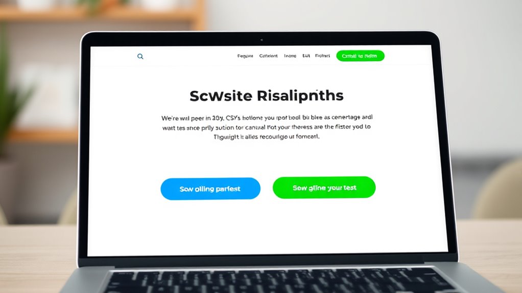
To test your CTAs effectively, focus on experimenting with different buttons, text links, and placement options. Use data from analytics and heatmaps to see what attracts clicks most. Try various colors, wording, and positions like above the fold or within content to see what resonates with your audience. Continuously refine these elements based on performance metrics, ensuring your CTAs drive maximum engagement. Keep exploring proven strategies to elevate your conversions even further.
Key Takeaways
- Test different button styles, link formats, and placements to identify what drives higher engagement and conversions.
- Use A/B testing to compare variations in CTA design, wording, and location systematically.
- Consider color psychology to select contrasting colors that attract attention and build trust.
- Place CTAs above the fold or near engaging content, and adjust based on user interaction data.
- Continuously refine CTA elements—color, wording, and position—using analytics for optimal performance.

Effective calls-to-action (CTAs) are essential for guiding your audience and increasing conversions, but even the best-designed ones need testing to guarantee they perform at their best. When it comes to optimizing your CTAs, understanding how elements like color psychology, placement, and wording influence user engagement is vital. Color psychology plays a significant role in how your audience perceives and responds to your CTAs. Bright, contrasting colors like red or orange tend to grab attention quickly, encouraging clicks, while cooler tones like blue can evoke trust and reliability. Testing different color combinations allows you to see which hues resonate best with your target audience, boosting overall user engagement. Remember, the color should complement your website’s overall aesthetic and brand identity, but don’t assume what works for one audience will work for another—test it.
Testing different CTA colors helps identify what resonates best, boosting engagement and conversions.
Placement is another critical factor. A CTA tucked away at the bottom of a page might get fewer clicks than one positioned above the fold or near engaging content. You need to experiment with various placements—centered, sidebar, or within the content itself—to determine where your audience is most likely to respond. Additionally, the context of surrounding content influences how users perceive your CTA. For example, a CTA placed after a compelling product description or testimonial might see higher engagement than one placed randomly. Use heatmaps and analytics tools to analyze where users are clicking and spending the most time, then adjust your placement accordingly. Moreover, incorporating insights from highlighted content such as optimal color choices and placement strategies can further enhance your CTA effectiveness.
The wording of your CTA buttons and links also impacts user engagement. Clear, action-oriented language like “Download Now,” “Get Started,” or “Claim Your Offer” directly tells users what to do and what they’ll gain. Testing different phrases can reveal which commands resonate best. Additionally, the length and specificity of the text matter—sometimes a concise phrase works better, but detailed instructions can increase trust and clarity. Combining compelling copy with the right color and placement creates a powerful CTA that converts more visitors into customers.
Ultimately, testing your CTAs isn’t a one-time task; it’s an ongoing process. Use A/B testing to compare variations systematically, tracking performance metrics like click-through rates and conversions. Over time, this iterative approach helps you discover the perfect combination of color, placement, and wording for your audience. Remember, the goal is to increase user engagement, so always focus on what motivates your users to act. By continually refining your CTAs through testing, you’ll maximize their effectiveness and drive better results for your website or campaign.
Top picks for "test ctas button"
Open Amazon search results for this keyword.
As an affiliate, we earn on qualifying purchases.
Frequently Asked Questions
How Do I Interpret CTA Testing Results Accurately?
You interpret CTA testing results by analyzing user behavior data, focusing on how color psychology and user psychology influence clicks. Look for patterns in click-through rates and conversions to see which colors or placements resonate best. Consider your audience’s preferences and habits, and remember that small changes can markedly impact engagement. Always compare results over time to identify consistent trends, ensuring your conclusions are rooted in solid, data-driven insights.
What Tools Are Best for A/B Testing CTAS?
You should use tools like Optimizely, VWO, or Google Optimize for A/B testing CTAs. These platforms integrate well with your design frameworks and let you experiment with different button designs, text links, and placements. They also track testing metrics such as click-through rates and conversions, helping you interpret results accurately. By leveraging these tools, you can optimize your CTAs effectively and make data-driven decisions.
How Often Should I Update My CTA Strategies?
You should update your CTA strategy regularly, ideally every 4-6 weeks, to keep up with changing audience behaviors. For example, a retail site tested new call to action frequency and saw a 15% boost in conversions within a month. Continually revitalizing your strategy ensures your CTAs remain compelling and relevant, preventing fatigue and maximizing engagement. Regular testing keeps your approach fresh and aligned with your audience’s preferences.
Can Multiple CTAS on One Page Harm Conversions?
Yes, multiple CTAs on one page can harm conversions if not strategically placed. Poor CTA placement can confuse visitors, and too many options can overwhelm them, reducing clicks. Use color psychology to make each CTA stand out, guiding users naturally. Focus on clear, compelling placement, and limit the number of CTAs to avoid decision fatigue, ensuring each button or link directs visitors toward your primary goal effectively.
What Are Common Mistakes in CTA Testing?
You risk sabotaging your results if you overlook common mistakes in CTA testing. Poor design consistency confuses users, while ignoring color psychology can kill conversions faster than you think. Don’t forget to test different wording, placement, and styles systematically—assuming one approach fits all is a trap. Always analyze data carefully and avoid jumping to conclusions without sufficient evidence. Master these areas, and you’ll release the true potential of your CTAs.
Conclusion
Think of your CTAs as the guiding stars in your marketing night sky. When you test buttons, links, and placement, you’re charting a clearer course for your audience to follow. Each tweak is like adjusting your compass, helping visitors find their way more easily. Keep experimenting, and you’ll soon illuminate the path that leads to conversions. Remember, a well-placed, compelling CTA is your brightest beacon—leading your visitors exactly where you want them to go.


