If you’re looking to elevate your design skills, these 13 top color theory books offer valuable insights. From practical guides like *The Complete Color Harmony, Pantone Edition* to inspiring references such as *A Dictionary Of Color Combinations*, each book covers essential concepts like color psychology, harmony, and cultural meanings. Whether you prefer visual palettes or technical explanations, these titles can transform your creative approach. Stay with me, and you’ll discover how to select the perfect resource for your needs.
Key Takeaways
- Look for books offering comprehensive color theory, psychology, and emotional impact tailored for design applications.
- Prioritize resources with visual examples, palettes, and practical exercises to enhance understanding and creativity.
- Choose titles that cover color harmony, pigment mixing, and cultural influences for a well-rounded perspective.
- Select durable, high-quality books with clear layouts and visuals that facilitate quick reference and learning.
- Consider books that integrate modern tools like Pantone palettes and digital color matching for versatile use.
The Complete Color Harmony, Pantone Edition
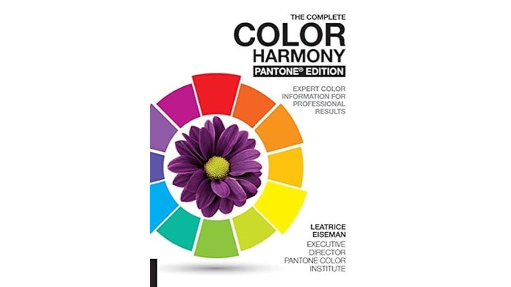
If you’re a designer looking for a thorough resource to master color harmony, *The Complete Color Harmony, Pantone Edition* is an excellent choice. This series, starting in 1987, has evolved to include diverse palettes and applications across fashion, interior design, and fiber arts. It offers in-depth insights into color theory, psychology, and mood, helping you understand how color impacts emotions and personality. The book features hundreds of Pantone-linked palettes, organized by themes and moods, with vibrant visuals that inspire creativity. Whether you’re working on watercolor, needlework, or branding, this edition provides practical guidance and a solid foundation for innovative color use.
Best For: designers, artists, and hobbyists seeking a comprehensive and visually inspiring resource for mastering color harmony with practical applications across various creative fields.
Pros:
- Extensive and diverse Pantone-linked color palettes that inspire creativity and innovation
- In-depth coverage of color theory, psychology, and mood to deepen understanding of color impact
- High-quality, vibrant visuals and practical guidance suitable for both learning and professional use
Cons:
- Some editions may have printing or paper quality issues, such as faded colors or strong scents
- The ring format displaying proportions can be distracting or take up extra space
- The extensive content might be overwhelming for beginners without prior color knowledge
A Dictionary Of Color Combinations Vol 1
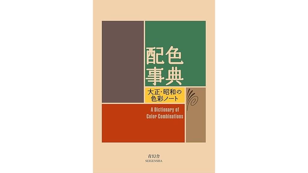
A Dictionary of Color Combinations Vol. 1 stands out as an essential resource for artists, designers, and enthusiasts who seek a visually inspiring and practical reference. This compact, beautifully designed book offers carefully curated color palettes, including two-, three-, and four-color harmonies with English names and CMYK recipes. Its minimalist layout and high-quality Japanese printing make exploring color combinations a tactile delight. Inspired by traditional Japanese design from the 1930s, it provides cultural insights and timeless palettes. Though some content is in Japanese, translation tools make it accessible. Overall, it sparks creativity, aids in color matching, and makes a lovely gift for any creative soul.
Best For: artists, designers, and creative enthusiasts interested in exploring traditional Japanese color palettes and vintage-inspired color harmony references.
Pros:
- Beautiful, minimalist design with high-quality Japanese printing enhances visual appeal and tactile experience
- Offers a diverse range of carefully curated two-, three-, and four-color palettes with clear English labels and CMYK recipes for easy application
- Provides cultural insights and timeless color combinations inspired by Japanese design from the 1930s, enriching creative inspiration
Cons:
- Some content and descriptions are only available in Japanese, requiring translation tools for full understanding
- Limited focus on modern practical applications or contemporary design trends
- Minor defects on the cover reported by some users, though easily repairable
The Designers Dictionary of Color

The Designers Dictionary of Color stands out as an essential resource for artists, designers, and enthusiasts enthusiastic to deepen their understanding of color. This thorough book offers detailed insights into color creation, emotional effects, cultural meanings, and historical significance. Its rich visual examples—from Renaissance sculptures to modern magazine prints—make concepts tangible and inspiring. The high-quality printing and durable hardcover ensure it’s a lasting reference. Many users find it elevates their work, especially in digital art and social media, by providing precise palettes and cultural context. Overall, it’s a valuable tool for anyone wanting to master the nuances of color in their creative projects.
Best For: artists, designers, and color enthusiasts seeking a comprehensive understanding of color theory, cultural meanings, and historical context to enhance their creative work.
Pros:
- Rich visual examples from various eras that make color concepts accessible and inspiring
- High-quality printing and durable hardcover for long-lasting reference
- Detailed insights into emotional effects and cultural significance of colors
Cons:
- Handling with care is required to avoid water damage that can ruin pages
- Might be overwhelming for beginners due to the depth of information
- The hardcover can be bulky for casual or on-the-go reference
Palette Guide for Graphic Designers and Illustrators
For graphic designers and illustrators seeking a thorough resource on color combinations and their cultural significance, this Palette Guide stands out as an invaluable tool. It offers detailed insights into color meanings, histories, and cultural references, along with practical codes and examples. The book features stunning palettes, including gold, silver, fluorescent shades, and diverse styles, inspiring creative projects. It’s perfect for both professionals and emerging artists, helping you find harmonious, meaningful color schemes. Despite packaging issues, the high-quality images and rich content make this guide a constant source of inspiration and education, elevating your understanding of color’s impact.
Best For: graphic designers, illustrators, and art students seeking a comprehensive, inspiring resource on color theory, combinations, and cultural significance to enhance their creative projects.
Pros:
- Rich in detailed color examples, codes, and historical insights that deepen understanding.
- Features stunning and diverse palettes, including metallics and fluorescents, for versatile inspiration.
- High-quality images and content praised for their clarity and educational value, making it a valuable reference.
Cons:
- Packaging and handling issues have led to damaged covers and edges, affecting the physical condition of the book.
- Some customers received replacements that were worse than the original, indicating packaging concerns.
- The protective cover may not sufficiently prevent damage during shipping or storage, requiring careful handling.
Color Theory for Artists
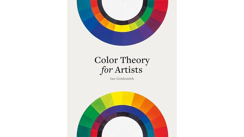
If you’re an artist enthusiastic to deepen your understanding of color, “Color Theory for Artists” offers a perfect blend of thorough insight and visual inspiration. This book simplifies complex color concepts without sacrificing depth, making it accessible for beginners and seasoned artists alike. Beautiful pictures complement the educational content, making learning engaging and enjoyable. Whether you’re exploring color mixing, harmony, or emotional impact, it provides practical guidance backed by stunning visuals. I highly recommend it to anyone passionate about refining their artistic palette, as it enriches your understanding of working with color and enhances your creative process.
Best For: artists of all skill levels seeking to deepen their understanding of color theory and improve their artistic work.
Pros:
- Well written and accessible, making complex concepts easy to understand
- Beautiful visuals that enhance learning and engagement
- Suitable for both beginners and experienced artists looking to refine their skills
Cons:
- May require some prior interest in art to fully appreciate the content
- Could be too detailed for those seeking only a basic overview of color theory
- As a book, it may not replace hands-on practice or digital resources for mastering color techniques
Essential Color Card Deck
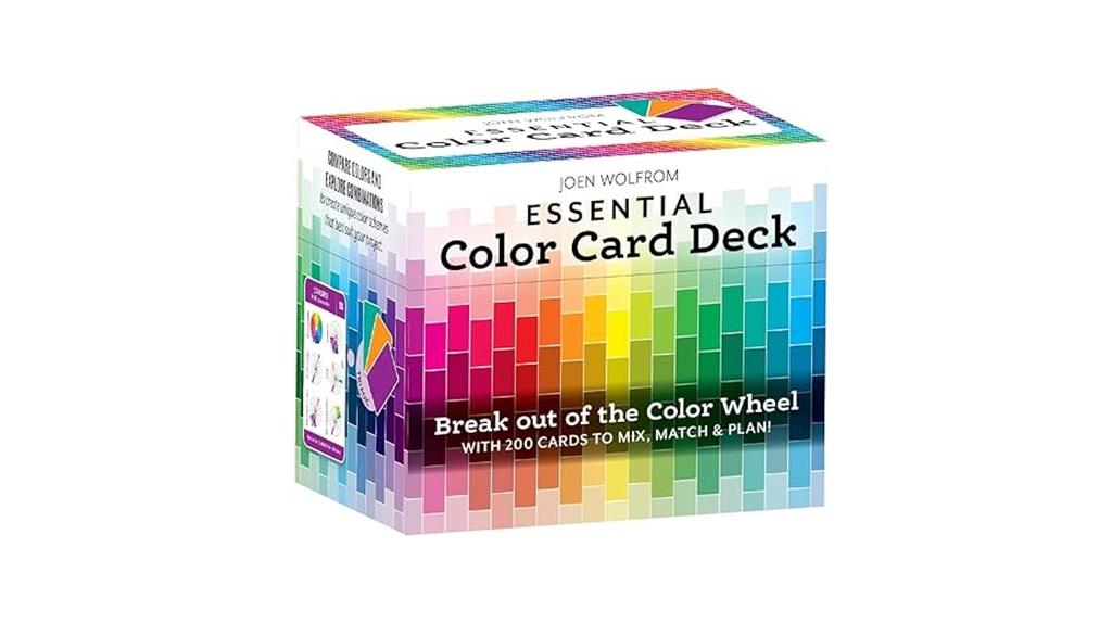
Designed for both beginners and seasoned designers, the Essential Color Card Deck provides a practical, hands-on tool to master color relationships quickly. With 200 cards covering hues, tints, tones, shades, and values, it offers a thorough way to understand color dynamics. Each card shows six variations of a color, and the back features a color wheel with adjacent and complementary hues, making matching effortless. Compact and organized, the deck includes helpful instructions, making it user-friendly for all skill levels. It’s perfect for selecting harmonious palettes, planning projects, and exploring color options, ultimately enhancing your creative process and confidence.
Best For: artists, designers, crafters, and hobbyists seeking a comprehensive, easy-to-use tool to improve color selection, coordination, and understanding of color relationships across various creative projects.
Pros:
- Provides a wide range of hues, tints, tones, shades, and values for versatile color exploration
- Features a color wheel on each card for quick matching of complementary and adjacent hues
- Compact, durable, and user-friendly, suitable for both beginners and experienced professionals
Cons:
- Some users have reported minor print omissions on a few cards
- The deck may be overwhelming for absolute beginners without prior color theory knowledge
- Limited to physical cards; lacks digital or interactive features for remote or digital use
The Pocket Complete Color Harmony Book
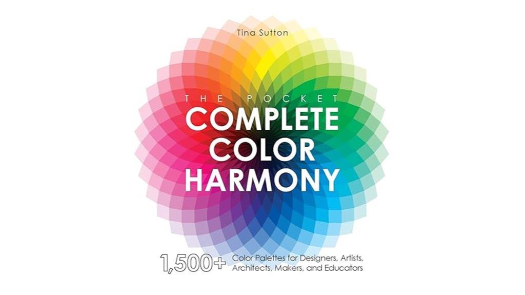
Looking for a quick and portable reference to color harmony? The Pocket Complete Color Harmony Book is perfect for designers on the move. Its small size—just 12.7 x 12.7 cm—fits easily into a bag or pocket, yet it packs over 1,500 color palettes, charts, and conversion tools. It offers straightforward explanations of color theory, harmony, and effects, along with visual examples that make complex concepts simple. Whether you’re working on digital projects, interior design, or crafts, this book helps you select and mix colors confidently. Its practical content and portability make it an invaluable companion for both beginners and pros seeking inspiration and guidance anytime.
Best For: artists, designers, educators, and hobbyists who need a compact, versatile reference for color harmony, palettes, and mixing guidance on the go.
Pros:
- Extremely portable size fits easily into pockets and bags, perfect for on-the-spot reference.
- Over 1,500 color palettes, charts, and conversion tools provide extensive options for various projects.
- Clear explanations and visual examples simplify complex color theory concepts for all skill levels.
Cons:
- The small size limits detailed work and may require additional resources for in-depth projects.
- Lacks artistic inspiration from artworks or nature, focusing more on palettes than creative prompts.
- Limited space for notes or customization, which might reduce its usability for some professional workflows.
Pantone The Twentieth Century in Color Book
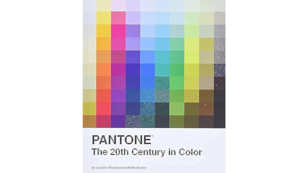
The Pantone The Twentieth Century in Color Book stands out as an essential resource for artists, designers, and color enthusiasts who want a visually rich overview of 20th-century color trends. It offers a holistic look at how colors influenced art, fashion, and design throughout the century. The book features vibrant images, detailed explanations, and a sturdy, attractive layout that makes it easy to reference. Many users appreciate its historical insights and inspiring visuals, making it a perfect addition to both personal collections and professional libraries. It’s a practical, beautiful guide that deepens your understanding of color’s role in shaping modern aesthetics.
Best For: artists, designers, and color enthusiasts seeking a visually rich and comprehensive overview of 20th-century color trends and their influence on art, fashion, and design.
Pros:
- Beautifully presented with vibrant images and high-quality printing.
- Provides detailed insights into color history and its impact on various design movements.
- User-friendly layout making it easy to reference quickly and efficiently.
Cons:
- Some users may find it less useful if they are seeking in-depth technical color theory.
- The hardcover edition can be relatively heavy for casual browsing.
- Price may be higher for those purchasing from secondary markets compared to direct from Pantone.
Artists Master Series: Color and Light
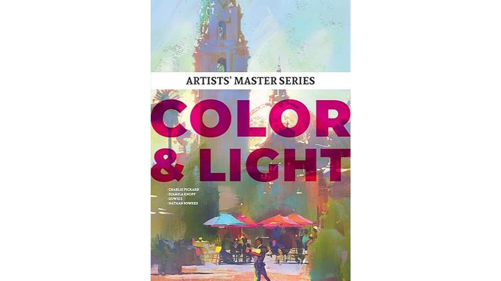
If you’re an artist enthusiastic to deepen your understanding of how light and color influence your work, Artists Master Series: Color and Light stands out as an essential resource. This book offers thorough, clear explanations with visual examples and practical lessons that appeal to both beginners and advanced artists. It covers fundamentals like color mixing and light behavior, as well as advanced techniques for creating depth, mood, and realism. Many artists report that studying this series considerably improves their rendering skills and helps troubleshoot tricky areas. Its well-organized content and inspiring portfolio showcases make it a must-have for anyone serious about mastering color, light, and artistic technique.
Best For: artists of all levels who want to deepen their understanding of how light and color influence their artwork and improve their technical skills.
Pros:
- Comprehensive coverage of both fundamental and advanced color and light techniques
- Clear, visually engaging explanations with practical, step-by-step lessons
- Inspires and educates through master artist portfolios and technical insights
Cons:
- Some users find the print quality of images to be less vibrant than expected
- The book’s physical size may be bulky for casual browsing or portable use
- Slightly higher price point reflects its extensive and detailed content
Color Theory For Dummies
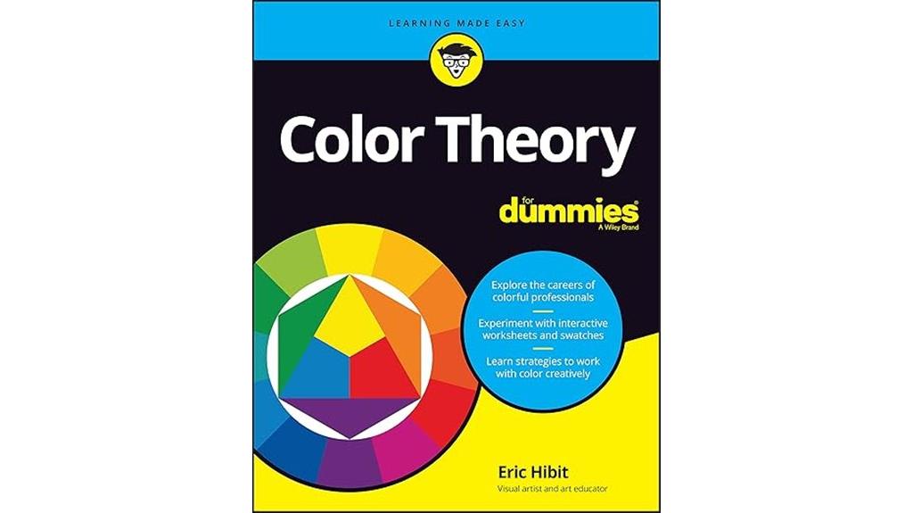
Color Theory For Dummies stands out as an ideal resource for beginners and professionals alike who want to deepen their understanding of color. I appreciate how it offers thorough, well-researched explanations that are accessible and engaging. The full-color illustrations and practical exercises make complex concepts easier to grasp, especially when exploring color relationships, palettes, and their applications. I’ve found its historical, scientific, and artistic insights invaluable for broadening my perspective. Whether you’re self-learning, teaching, or working professionally, this book boosts your vocabulary and skills, helping you create more effective and harmonious color schemes confidently. It’s truly a versatile, enriching guide for mastering color theory.
Best For: beginners and professionals seeking a comprehensive, visually-rich resource to deepen their understanding of color theory and its practical applications.
Pros:
- Thorough, well-researched explanations suitable for all skill levels
- Full-color illustrations and practical exercises enhance learning and retention
- Covers historical, scientific, and artistic contexts for a well-rounded perspective
Cons:
- May be too detailed for those only interested in basic color concepts
- Some users might find the depth of information overwhelming initially
- The detailed illustrations and content could increase the book’s size and cost
Color Choices: Making Color Sense Out of Color Theory
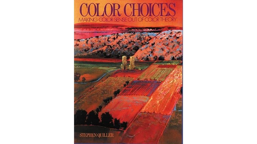
For designers seeking to translate color theory into effective visual choices, understanding how to make confident color decisions is essential. Stephen Quiller’s “Color Choices” helps bridge theory and practice by teaching you how to mix pigments, create neutrals, and understand color relationships in real-world mediums like watercolor and oil. The book emphasizes that color is an expressive tool—capable of conveying mood, harmony, or contrast. Through exercises and the “Six Studies” method, you’ll learn to analyze and craft color schemes intentionally. Ultimately, gaining color sense empowers you to make deliberate choices that enhance your artwork’s emotional impact and visual harmony.
Best For: artists and designers seeking to deepen their understanding of color relationships, mixing, and emotional expression through practical application of color theory.
Pros:
- Provides clear guidance on pigment mixing, neutral creation, and real-world application in various mediums.
- Emphasizes the expressive power of color to convey mood, harmony, and contrast.
- Includes exercises and the innovative “Six Studies” method to enhance analytical skills and creative decision-making.
Cons:
- May require prior familiarity with basic color concepts for full benefit.
- Focuses primarily on painting mediums like watercolor and oil, which might be less relevant for digital artists.
- Some users might find the technical details of pigment mixing complex or challenging to master initially.
Color Third Edition: A workshop for artists and designers
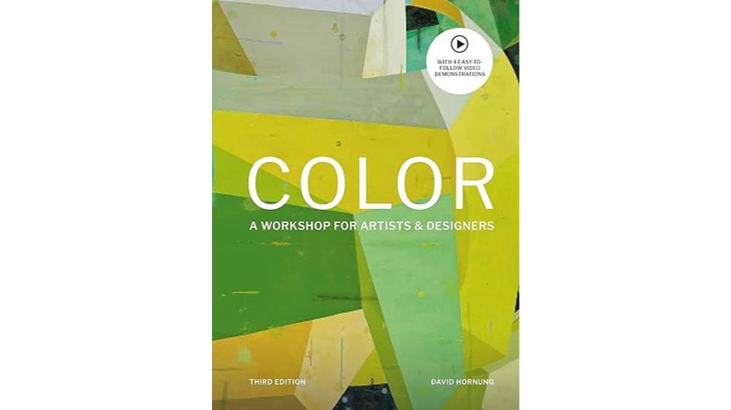
Color Third Edition: A workshop for artists and designers stands out as an ideal resource for both beginners and experienced creatives looking to deepen their understanding of color perception. This all-encompassing book offers clear explanations, structured exercises, and engaging activities that develop sensory awareness of color. Authored by seasoned artist and instructor David Hornung, it combines visual demonstrations with practical tasks, making complex concepts accessible. The inclusion of beautiful illustrations and sample artworks enhances the learning experience. Whether you’re just starting or refining your skills, this workshop-style guide will transform how you see and use color, making it an invaluable addition to your creative toolkit.
Best For: artists, designers, and hobbyists seeking a comprehensive, hands-on approach to mastering color perception and theory.
Pros:
- Clear explanations and structured exercises that enhance sensory understanding of color
- Beautiful illustrations and sample artworks that enrich the learning experience
- Suitable for both beginners and experienced professionals, with practical activities for all skill levels
Cons:
- Some exercises may take up to 8 hours to complete, requiring a significant time commitment
- Availability of recommended acrylic gauche paints may be limited or require waiting
- The book’s focus on specific materials might necessitate additional resources for varied mediums
Werners Nomenclature of Colours Book on Colours
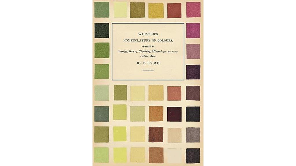
If you’re passionate about accurately describing and understanding colors in nature, Werners Nomenclature of Colours stands out as an essential resource. This fascinating book covers colors observed across zoology, botany, chemistry, mineralogy, anatomy, and the arts, making it a versatile reference. Its detailed descriptions, often referencing observation locations, are both enjoyable and enlightening. The book’s aesthetic appeal, with pages mimicking aged paper, adds to its charm, though some may prefer standard white paper. While the physical copy is highly recommended, beware of poor-quality reproductions. Overall, it’s a beautiful, insightful gem, perfect for art lovers, artists, and antique book enthusiasts.
Best For: art enthusiasts, artists, naturalists, and antique book collectors seeking a detailed and beautiful reference on colors observed in nature.
Pros:
- Rich, detailed color descriptions with references to observation locations, enhancing understanding and appreciation.
- Aesthetic appeal with pages mimicking aged paper, adding a vintage charm suitable for display or framing.
- Highly regarded as a valuable, insightful resource for those passionate about colors in nature and arts.
Cons:
- Some reproductions and photocopies are of poor quality, with issues like missing sections and color distortion.
- The physical book can be expensive, and some users find the material quality, including paper and printing, lacking.
- The Kindle version may not meet expectations, lacking the physical charm and quality of the hardcover edition.
Factors to Consider When Choosing Color Theory Books for Designers

When selecting a color theory book, I look at how well it matches my skill level and the specific topics I need to learn. I also consider its visual clarity and layout, since well-designed pages make complex concepts easier to understand. Ultimately, I check if the book emphasizes practical use and reflects cultural or historical perspectives relevant to my work.
Content Depth and Scope
Choosing the right color theory book means evaluating whether it offers a thorough yet practical overview of core principles like hue, value, saturation, and contrast. You want a resource that balances solid theoretical explanations with visual examples and exercises, so you can apply what you learn directly to your projects. It’s also important that the scope aligns with your specific needs, whether that’s branding, interior design, digital media, or fashion. Look for books that incorporate contemporary color trends, tools like Pantone systems, and digital color matching techniques, as these are essential in today’s fast-paced design environment. Additionally, a well-rounded book should explore cultural, psychological, and emotional aspects of color, giving you a richer understanding to communicate effectively through your designs.
Visual Quality and Layout
A well-designed color theory book captures your attention through clear visuals and thoughtful layout choices, making complex concepts easier to grasp. High-quality images with accurate colors are essential, as they help you see true hues and understand their relationships. The layout should organize content logically, using visual hierarchies, headings, and white space to improve readability and reduce clutter. Consistent use of color swatches, charts, and diagrams allows quick comparisons and deeper understanding of color interactions. Typography matters too—legible fonts with appropriate sizes and styles should complement the visuals without distraction. Overall, aesthetic coherence between visuals and text creates an engaging learning experience, reflecting the book’s attention to visual communication and making it easier for you to absorb and apply color theory principles effectively.
Practical Application Focus
To effectively translate color theory into your design projects, look for books that include practical exercises and real-world examples. These features help you apply concepts directly to branding, interior design, or digital media, making theory more tangible. Seek resources with clear guidance on translating color schemes into specific contexts, along with visual examples, palettes, and step-by-step instructions to facilitate hands-on learning. It’s also important that the book covers how to adapt color principles across various mediums, boosting your versatility. Additionally, choose books that emphasize the psychological and emotional impacts of color, so you can strategically harness color’s influence in your work. Practical application-focused books bridge the gap between theory and practice, empowering you to create more compelling, intentional designs.
Audience Level Compatibility
How do you guarantee a color theory book aligns with your current skill level? First, assess whether the book’s complexity matches your knowledge—whether you’re a beginner, intermediate, or advanced. Check if the language and explanations are accessible to your reading level to ensure smooth learning without frustration. It’s important that the content suits your specific design discipline, whether it’s graphic design, interior design, fashion, or digital art. Look for books offering practical exercises and applications tailored to your skills to reinforce what you learn. Additionally, consider whether the presentation style, visuals, and instructional approach resonate with your preferred learning method. Choosing a book that fits your current expertise will make your learning journey more effective and enjoyable.
Cultural and Historical Relevance
Considering the cultural and historical context of a color theory book is essential because it enriches your understanding of how colors have been perceived and used throughout different eras and societies. A book that integrates historical insights and cultural significance helps you see beyond modern practices, revealing how color symbolism varies worldwide and influences design choices. These texts often showcase classic color schemes and their evolution, offering a deeper grasp of longstanding principles and aesthetic standards. Such content enhances your appreciation for the emotional and communicative power of colors, connecting contemporary work with traditional and global color usage. Choosing a book with rich cultural and historical details broadens your perspective, enabling you to craft designs that are both meaningful and culturally sensitive.
Illustrations and Examples
When selecting a color theory book for designers, the quality and variety of visual examples it offers can make a significant difference in understanding the concepts. I look for books that include clear, high-quality images like color wheels, palettes, and project demonstrations, which help me grasp relationships and harmony. It’s essential that the visuals are vibrant and accurately represent colors to aid realistic visualization. I also value labeled examples of color schemes—complementary, analogous, triadic—that I can directly apply to my work. Additionally, books with step-by-step illustrations of color mixing, shading, and tonal variations make complex ideas easier to understand. Including diverse visuals, from historical schemes to modern digital applications, broadens my perspective on how color theory applies across different design contexts.
Format and Portability
Are you choosing a color theory book that fits seamlessly into your busy, mobile workflow? Consider its size and weight—compact and lightweight options are ideal if you need to carry it around frequently. Look for durable formats like hardcover or spiral-bound editions, which can withstand regular handling, especially in fieldwork. The layout should support quick reference, with clear visuals and easy-to-navigate pages, boosting usability on the go. Additionally, check if digital or e-book versions are available; these provide instant access across devices and are perfect for quick consultations. If portability is a priority, opt for smaller books that easily fit into bags, pockets, or travel kits, ensuring you can access color theory insights anytime, anywhere.
Price and Value
Choosing a color theory book that offers good value for your money means looking beyond just the price tag. I consider the depth and quality of the content—does it cover essential topics like color harmony, psychology, and practical application thoroughly? A higher price might be justified if the book includes useful features like color charts, palettes, or exercises that enhance learning. I also check reviews and the author’s reputation to ensure the information is reliable and authoritative. Investing in well-reviewed books often pays off in the long run, supporting both professional growth and creative confidence. Ultimately, I look for a balance between cost and benefit, choosing resources that deliver detailed, practical insights worth the investment.
Frequently Asked Questions
How Do I Select the Best Color Theory Book for My Design Style?
To pick the best color theory book for my design style, I first consider what I want to learn—whether it’s basics or advanced techniques. I look for books that match my experience level and preferred design aesthetic. I also read reviews and sample pages, ensuring the author’s approach resonates with me. Ultimately, I choose one that inspires me and fits my creative goals perfectly.
Are These Books Suitable for Beginner or Advanced Designers?
Imagine a vibrant palette that welcomes both dawn’s gentle hues and dusk’s deep shadows—that’s how these books serve different skill levels. They’re perfect for both beginners enthusiastic to grasp foundational concepts and advanced designers refining their mastery. I’ve found that their clear explanations and inspiring visuals make them versatile tools, helping anyone deepen their understanding of color, regardless of where they stand in their creative journey.
Do These Books Include Practical Exercises or Just Theory?
Yes, these books include practical exercises along with theory, which I find incredibly helpful. They don’t just explain concepts but also offer hands-on activities to apply what you learn. This combination makes it easier to grasp color principles and incorporate them into your designs. I’ve found that actively practicing with exercises deepens my understanding and boosts my creativity, making these books valuable resources for both beginners and experienced designers.
Which Book Offers the Most Comprehensive Historical Color Context?
If you’re after a book with rich historical color context, I recommend Johannes Itten’s “The Art of Color.” It’s like a journey through time, blending art history with practical insights. Unlike dry textbooks, Itten’s work immerses you in color’s evolution, making it perfect for understanding how color influences design today. It’s a fascinating read that deepens your appreciation and sharpens your creative palette.
Can These Resources Help With Digital Versus Print Color Applications?
Absolutely, these resources can help with both digital and print color applications. I’ve found that they clarify how colors behave across different mediums, highlighting the importance of color profiles, calibration, and viewing conditions. By understanding these principles, I can make more informed choices for my projects, ensuring consistent and vibrant results whether I’m designing for screens or print. It’s a game-changer for any designer aiming for precision.
Conclusion
If you’re serious about elevating your design game, these books are your secret weapons—think of them as your modern-day compasses in a sea of colors. They’re packed with insights that can turn even a humble palette into a work of art, much like the masters of yore relied on timeless principles. plunge in, experiment, and let your creative palette flourish—after all, in the world of design, knowledge is your greatest armor.


