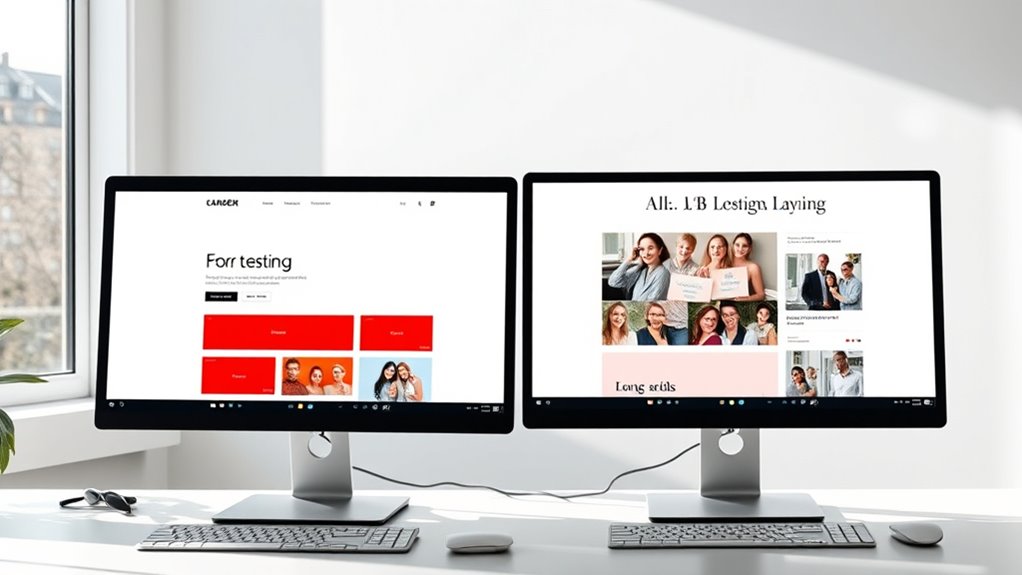
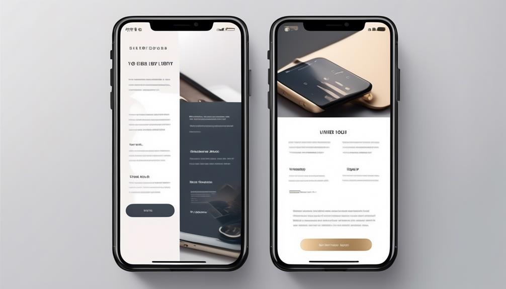
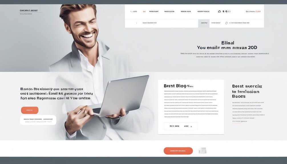
To effectively A/B test design elements like fonts, colors, and layouts, focus on systematic variations that impact user engagement. Experiment with different font styles for readability, contrasting colors to highlight calls to action, and layout arrangements that guide users naturally through content. Small tweaks can lead to big improvements, so track each change’s performance carefully. Continuing to explore these testing strategies will help you optimize your website and drive better conversions.
Key Takeaways
- Systematically test different fonts, colors, and layouts to identify those that best enhance user engagement and conversion rates.
- Use contrasting colors and clear font styles to improve readability and draw attention to key call-to-action elements.
- Experiment with layout arrangements, such as positioning of buttons and images, to optimize user flow and interaction.
- Analyze data from A/B tests to determine which design variations lead to higher click-through and engagement metrics.
- Implement small, targeted modifications and continuously refine design elements based on user response insights.

A/B testing is a powerful way to optimize your website or app by comparing different design elements to see which performs better. When it comes to choosing the right fonts, colors, and layouts, small adjustments can lead to significant improvements in user engagement and conversions. One key aspect to focus on is your call to action buttons. Their design, placement, and wording can make or break your conversion rates. Testing different styles—such as contrasting colors, rounded versus square shapes, or varying text—helps you identify what prompts users to click most often. For instance, a bright, attention-grabbing call to action button placed prominently above the fold often outperforms a subtle, tucked-away button. You might find that changing the size or wording of your call to action boosts clicks, but only through systematic testing will you discover the best approach for your audience.
Testing different call-to-action styles reveals what boosts user clicks most effectively.
Image placement also plays a critical role in your site’s effectiveness. The way you position images can influence how users navigate your content and where they focus their attention. For example, placing an engaging product image near the call to action can draw the eye toward the desired action, increasing the chance of a click. Alternatively, testing different image sizes or styles—such as full-width banners versus smaller thumbnails—and observing how users respond gives you insights into what resonates most. Carefully analyzing the data from these tests allows you to optimize your layout so that images support your message without overwhelming or distracting visitors.
Layout variations, including the arrangement of text, images, and buttons, can dramatically impact user behavior. A clean, minimalist layout with clear visual hierarchy tends to lead to higher conversions because visitors can easily find what they need without feeling overwhelmed. Experimenting with different arrangements—like placing the call to action at the top versus the bottom of a page—can reveal where users are most likely to engage. Keep in mind that consistency in font choices and color schemes also influences how users perceive your brand and trustworthiness. Testing different fonts, from serif to sans-serif, helps you understand which style enhances readability and aligns with your brand identity. Additionally, incorporating frozen yogurt market insights can inspire creative design elements that appeal to health-conscious consumers.
In all these tests, remember that small, targeted changes often yield the most valuable insights. By methodically experimenting with call to action buttons, image placement, and layout structures, you’ll learn what truly drives user engagement. Data-driven decisions help you refine your design elements, making your website or app more effective and user-friendly over time. Ultimately, A/B testing empowers you to create a seamless experience that motivates visitors to take the actions you desire, whether that’s filling out a form, making a purchase, or subscribing to a newsletter.
Frequently Asked Questions
How Do I Prioritize Which Design Elements to Test First?
You should start by prioritizing design elements that impact user experience and visual hierarchy most. Focus on testing fonts and colors that influence readability and emotional appeal first, as they directly affect how users perceive and engage with your site. Next, experiment with layouts to optimize flow and ease of navigation. This approach guarantees you address the most influential factors first, improving overall user satisfaction and engagement efficiently.
What Tools Are Best for A/B Testing Design Elements?
Oh, you’re ready to play with the big guns? For testing design elements, use top tools like Optimizely, VWO, or Google Optimize—they’re your testing tools of choice. Pair them with design software like Figma or Adobe XD to craft stunning variations. These tools make it easy to experiment with fonts, colors, and layouts, so you can finally stop guessing and start making data-driven decisions that wow your users.
How Do I Interpret Conflicting Results From Different Tests?
When you encounter conflicting data from different tests, focus on test reconciliation by analyzing the context and variables involved. Look for patterns or external factors influencing results, such as timing or audience segments. Consider running additional tests to verify findings or combining data to get a clearer picture. Remember, conflicting results highlight the importance of thorough analysis and cautious decision-making rather than jumping to conclusions.
What Sample Size Is Sufficient for Reliable A/B Test Results?
A tiny sample size can sink your test faster than a sinking ship! To guarantee reliable results, aim for a sample size that achieves statistical significance, usually determined by your expected conversion rate, desired confidence level, and margin of error. Use online calculators or statistical formulas to find the right number. Generally, larger sample sizes boost accuracy, so don’t settle for less—your data’s trustworthiness depends on it!
How Frequently Should I Run A/B Tests on Design Elements?
You should run A/B tests on design elements regularly, ideally every few weeks or after significant website updates. This testing frequency guarantees you gather enough data for reliable results and supports continuous design iteration. By consistently testing, you stay responsive to user preferences, optimize engagement, and improve conversions over time. Remember, balancing testing frequency with sufficient sample sizes is key to making informed, impactful design decisions.
Conclusion
By testing fonts, colors, and layouts, you craft a user experience that’s both visually appealing and easy to navigate. Imagine your website as a vibrant canvas—each element a brushstroke—where small changes can turn chaos into harmony. Just like a painter steps back to see the full picture, your A/B tests reveal what truly resonates. Embrace these design elements, and watch your site transform from ordinary to extraordinary, one thoughtful tweak at a time.


