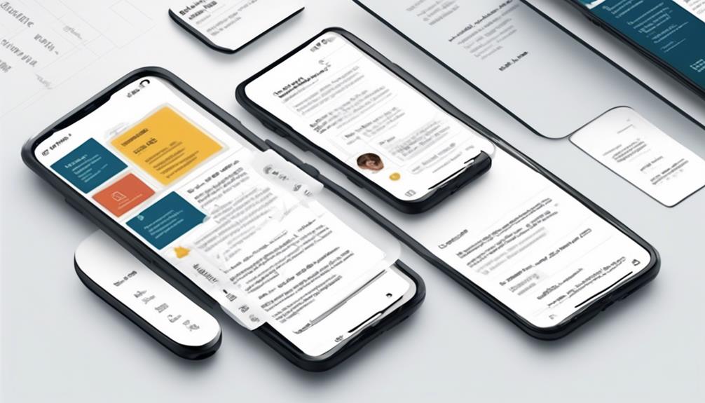
Are you feeling frustrated because your email designs aren’t performing as well on mobile as you had expected? You’re not alone. Luckily, there are a number of great strategies that can improve the mobile viewing experience of your emails.
From layout considerations to image and CTA best practices, we've got you covered. Stick around to discover how you can enhance engagement and capture attention with mobile-friendly email design.
Key Takeaways
- Craft concise and compelling subject lines and preheader text to capture attention.
- Utilize a single-column layout and keep email width between 320-550 pixels for enhanced readability on various screen sizes.
- Use visually appealing images and prominently place visually distinct CTAs to enhance engagement.
- Test emails across devices and email clients, monitor performance metrics, and stay updated with industry best practices for optimization.
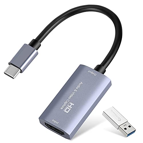
Guermok Video Capture Card, 4K USB3.0 HDMI to USB C Capture Card for Streaming, 1080P 60FPS, Compatible with iPad Mac OS Windows, Quest 3, OBS, PS5/4, Switch2/1, Xbox, Camera (Silver)
【1080P 60FPS Video Capture Card】 This HDMI game capture card is based on USB3.0 high speed transmission port,...
As an affiliate, we earn on qualifying purchases.
Importance of Mobile-Friendly Emails
Why are mobile-friendly emails crucial for effectively engaging subscribers and driving results in today's market?
With the exponential increase in mobile opens over the past decade, optimizing email design for mobile devices has become imperative. A responsive email design ensures that the content adapts seamlessly to various screen sizes, providing a consistent and engaging experience for subscribers across all devices.
The subject line and preheader text play pivotal roles in capturing the recipient's attention, especially on mobile devices where screen real estate is limited. Therefore, crafting concise and compelling subject lines and preheader text is essential for driving open rates and click-throughs.
When it comes to the actual email content, the use of a mobile-friendly template is non-negotiable. The layout and structure should be designed to accommodate the constraints of mobile screens, ensuring that the call to action is prominently displayed and easily accessible. Additionally, the use of concise and scannable text is crucial for conveying the message effectively within the limited attention span of mobile users.

Elgato Cam Link 4K – External Capture Card for DSLR & Camcorder, ActionCam as Webcam, Meet/Stream/Record in 1080p60 or 4K30/4K60, Easy Connect for OBS/Zoom/Discord – HDMI to USB 3.0, PC/Mac/iPad
Turn Your Camera into a Pro Webcam: Connect your DSLR or mirrorless camera to any computer and go...
As an affiliate, we earn on qualifying purchases.
Subject Line and Pre-Header Optimization
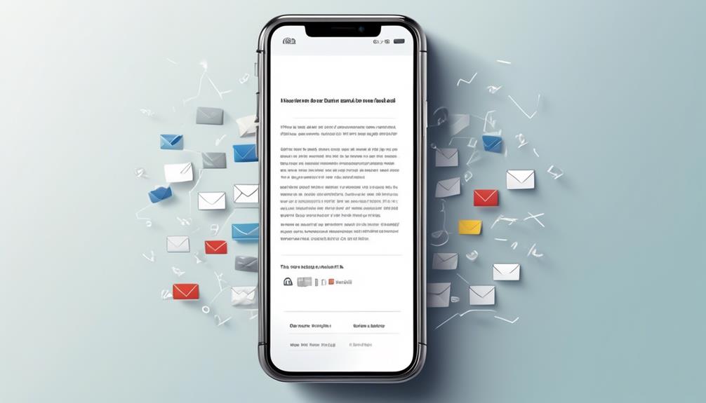
Due to the critical role of subject lines and pre-header text in capturing mobile users' attention, crafting concise and compelling messaging is essential for driving open rates and click-throughs.
When optimizing subject lines and pre-headers for mobile-friendly email design, it's important to consider the limitations of mobile devices, such as smaller screen sizes.
Here are some key tips for subject line and pre-header optimization:
- Craft subject lines that are 30-45 characters long for mobile devices to maximize open rates.
- Use pre-header text to offer additional context and entice readers to engage with the email content.
- Test different pre-header lengths based on subscriber behavior to optimize email campaigns.
- Ensure subject lines and pre-header text support each other to create a compelling message in the inbox.

acer USB 3.0 Video Capture Card, HDMI Capture Card for Streaming with 4K Loop-Out & USB A/C | 1080P 60Hz HD | Video Audio Game Capture for PS5/PS4/Switch2/Xbox/Camera/PC/Mac - Black
【4K Clarity, 1080P Performance】Enjoy stunning clarity with our USB 3.0 Video Capture Card—featuring 4K input and smooth 1080P@60Hz...
As an affiliate, we earn on qualifying purchases.
Design Layout Considerations
For optimal mobile-friendly email design, consider utilizing a single-column layout to enhance readability and user experience on various mobile devices. This layout ensures that the content is presented in a linear fashion, making it easier for recipients to scroll through and engage with the email.
When designing the layout, it's important to keep in mind the varying screen sizes of different devices. Aim to keep the email width between 320-550 pixels to ensure that it can adapt to a range of screen dimensions.
In addition, use responsive design techniques and responsive templates to ensure that the email layout adjusts seamlessly to the screen size of the recipient's device. This approach helps in maintaining the visual appeal and readability of the email across different devices and screen resolutions.
Optimizing images and using a legible font size and type are also crucial for enhancing the overall user experience. By adhering to these design considerations, you can create mobile-friendly emails that are visually appealing and easy to engage with on a variety of devices.
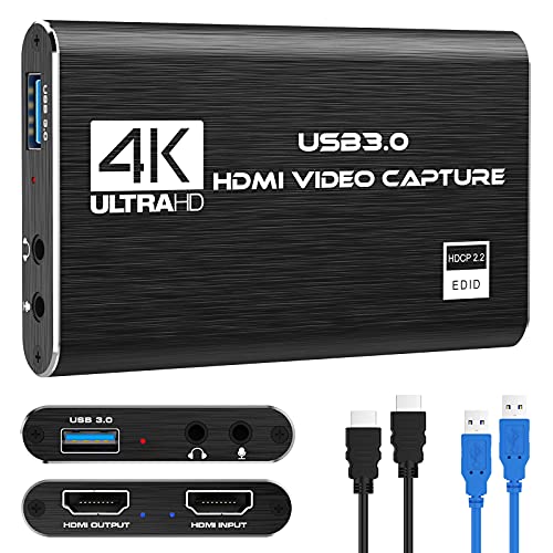
Capture Card Nintendo Switch, 4K HDMI Video Capture Card, 1080P 60FPS, HDMI to USB 3.0 Capture Card for Streaming Work with Camera/Xbox/PS4/PS5/PC/OBS
【1080P HD High Quality】Capture resolution up to 1080p for video source and it is ideal for all HDMI...
As an affiliate, we earn on qualifying purchases.
Image and CTA Best Practices
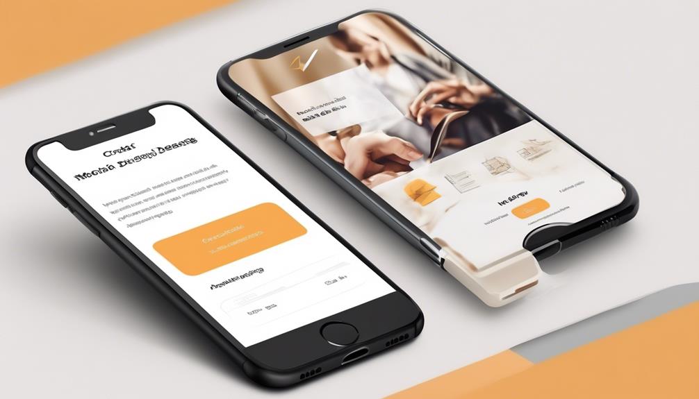
To create compelling and engaging mobile-friendly emails, it's essential to employ image and call-to-action (CTA) best practices that resonate with recipients and drive desired actions.
When it comes to images, use descriptive and compelling visuals that support your message and brand identity.
For CTAs, ensure they're prominently placed and visually distinct to encourage engagement. Design CTA buttons to be at least 44 x 44 pixels to maximize clickability on mobile devices.
Additionally, use clear and action-oriented language in your CTA to prompt the desired action from the reader.
Incorporating these best practices ensures that your mobile-friendly emails are visually appealing and optimized for the mobile experience. By using effective images and CTAs, you can enhance the overall responsiveness of your emails on small screens, ultimately improving the mobile version of your content.
It's important to keep in mind that creating mobile-friendly emails requires thoughtful consideration of both images and CTAs to ensure a seamless and engaging mobile experience for your recipients.
Testing and Optimization Across Devices
We consistently test our emails across various devices and email clients to ensure that our content displays optimally and consistently for all recipients. This testing is crucial in the realm of mobile-friendly email design, as it allows us to identify and address any rendering issues for different devices and operating systems.
By using email testing tools, we can proactively optimize our emails to ensure they're responsive and adapt well to the varying screen sizes of mobile devices. Additionally, we closely monitor email performance metrics such as open rates and click-through rates to continuously refine our design and content, ensuring that our emails are effectively engaging recipients across different devices.
Staying updated with industry best practices and trends is also paramount, as it enables us to stay ahead in mobile email design and cater to the evolving patterns of device usage, particularly the prevalence of mobile phone usage for email consumption.
Through our commitment to testing and optimization, we strive to deliver a seamless and compelling email experience for all our recipients.
How Can I Use Mobile-Friendly Email Design to Implement the 2024 Email Design Trends?
Implementing the ultimate email design trends 2024 involves embracing mobile-friendly layouts. With more people checking emails on their smartphones, optimizing for mobile is crucial. This means using responsive design, concise content, and clear CTAs. Incorporating interactive elements and incorporating dark mode options are also key elements to consider.
Frequently Asked Questions
How Do You Format an Email so It Looks Good on Mobile?
We format emails for mobile by keeping subject lines short.
We use pre-header text to provide additional context and entice readers to open the email.
We write concise content to ensure that it is easy to read on a small screen.
We also plan for an 'images off' experience by including alt text and providing a clear message even without images.
Additionally, we place call-to-action buttons at the top of the email to make it easy for readers to take action.
How Do I Make an Email Template Mobile Friendly?
Making an email template mobile-friendly is crucial for engaging readers on the go. We focus on optimizing layout and content for smaller screens.
Start with a clean, responsive design that adjusts to various devices.
Use concise, scannable copy and clear calls-to-action to guide user interaction.
Ensure images are optimized and consider the 'images off' experience.
Lastly, test your template on different devices to guarantee an optimal mobile viewing experience.
What Is an Appropriate Layout for an Email Being Optimized for Mobile?
We recommend using a single-column layout to optimize emails for mobile devices. This ensures better compatibility across various email clients and screen sizes.
It's also crucial to keep the email width between 320-550 pixels and use optimized images that scale properly.
Additionally, using a legible font size and breaking up content into scannable sections with headings and bullet points can enhance the mobile-friendly design.
What Size Should Email Design Be for Mobile?
We aim for an email design around 320-550 pixels wide to accommodate different screen sizes, with a focus on around 450 pixels for mobile. This ensures readability and engagement on various devices.
By keeping subject lines between 30-45 characters and using pre-header text, we entice mobile users to interact with the email.
Employing single-column design, optimizing images, and testing across devices ensures a seamless mobile experience.
Conclusion
As we navigate the ever-changing digital landscape, it's crucial to ensure that our emails are optimized for mobile viewing. By crafting attention-grabbing subject lines, striking a balance between text and visuals, and testing across various devices, we can create email campaigns that captivate our audience.
Just like a beautifully wrapped gift, a well-designed mobile-friendly email is sure to delight and engage recipients, driving the results we desire.
