Having an attractive website design is essential for attracting and retaining visitors. In today’s world where attention spans are short, it is crucial to create a visually appealing site that offers a smooth user experience.
Whether you’re a business owner or a marketer, understanding the importance of website design is key to staying ahead of the competition. In this article, we will share top website design tips that can help you enhance user experience and drive better results for your online presence. From utilizing white space to optimizing page speed, we will cover all the essential elements that can make a significant impact on your website’s performance.
So, let’s dive in and discover ways to create a captivating and user-friendly website!
Key Takeaways:
- Utilize white space to create a clean and modern look
- Optimize page speed to reduce bounce rates
- Use attractive calls to action for improved navigation
- Differentiate hyperlinks for easy identification
- Segment key information with bullet points for better readability
Use White Space
When it comes to website design, utilizing white space is a game-changer. White space refers to the empty space between elements on a page. It may seem counterintuitive, but incorporating more white space can actually enhance the user experience and make your website look clean and modern.
By strategically placing white space around text and titles, you can increase user attention by 20% and improve the legibility of your content. The extra breathing room allows users to focus on the essential information without feeling overwhelmed by cluttered visuals.
However, it’s essential to find the right balance. Allowing too much white space can result in valuable information being pushed below the fold, requiring users to scroll to access crucial content. Finding the sweet spot between an aesthetically pleasing design and delivering valuable information is key.
Take a look at the example below to see how white space can transform the look and feel of a webpage:
As you can see, the judicious use of white space creates a clean and organized layout, making it easier for users to navigate the webpage. The strategic placement of text and images allows each element to stand out, improving overall readability.
Incorporating white space into your website design not only enhances the user experience but also provides an opportunity to create a visually appealing and engaging platform. So don’t be afraid to embrace the whitespace and take your website design to the next level.
Make the most of white space:
- Use ample white space around text and titles to enhance legibility.
- Ensure the balance between white space and content is just right.
- Experiment with different layouts to find what works best for your website.
“Whitespace is like air. It is necessary for design to breathe.” – Wojciech Zielinski
Optimize Page Speed
Page speed plays a crucial role in delivering an optimal user experience for your website. Slow-loading pages can lead to increased bounce rates and negatively impact your site’s performance. To ensure fast loading times and keep users engaged, it’s essential to focus on optimizing page speed. Here are some key strategies:
- Compress Images: Large image files can significantly slow down your website. Compressing images reduces file size without compromising quality, resulting in faster load times. Make use of image compression tools or plugins to streamline your images. Remember, optimizing ALT tags is important for SEO as well.
- Optimize Website’s Code: Streamline your website’s code by minifying CSS and JavaScript files. Remove unnecessary whitespace, comments, and code. This helps reduce file sizes and improves page load times.
- Utilize Caching: Caching allows you to store frequently accessed elements of your website, such as images and CSS files, locally on a user’s device. By leveraging browser caching, you can significantly reduce server requests and improve page load speed for returning visitors.
- Enable Gzip Compression: Gzip compression compresses your website’s files before sending them to the user’s browser, reducing the amount of data transferred and speeding up load times. Most web servers and content management systems support Gzip compression.
To evaluate your website’s speed performance and identify areas for improvement, you can use the free PageSpeed Insights tool provided by Google. It analyzes your website’s speed on both mobile and desktop devices, providing suggestions and recommendations for optimization.
| Page Speed Optimization Techniques | Benefits |
|---|---|
| Compressing images | Reduces file size for faster loading times |
| Optimizing website’s code | Streamlines files, improves load times |
| Utilizing caching | Reduces server requests, improves load speed for returning visitors |
| Enabling Gzip compression | Reduces data transferred, speeds up load times |
Key Takeaways:
Optimizing page speed is crucial for delivering a seamless user experience. Compressing images, optimizing website code, utilizing caching, and enabling Gzip compression are effective strategies to improve load times and keep users engaged.
By implementing these techniques, you can ensure that your website loads quickly and efficiently, enhancing user satisfaction and reducing bounce rates.

Use Attractive Calls to Action
When it comes to website design, grabbing the attention of your users and guiding them towards desired actions is crucial. That’s where attractive calls to action (CTAs) come into play. By using action-oriented language and attention-grabbing colors, you can significantly improve website navigation and increase conversions.
Research has shown that color psychology plays a role in influencing user behavior. Different colors evoke different emotions and can have a significant impact on how users interact with your website. For example, using vibrant colors like red or orange for your CTAs can create a sense of urgency and encourage immediate action.
When designing your CTAs, make sure they are clearly marked and stand out from the rest of your content. Use bold fonts, larger sizes, or unique shapes to draw attention. Additionally, consider placing CTAs strategically throughout your website, such as at the end of blog posts or on landing pages.
To further enhance the effectiveness of your CTAs, use action-oriented language. Instead of simply saying “Learn More,” use phrases like “Start Your Free Trial” or “Get Instant Access.” Action verbs and clear directions prompt users to take the desired action, increasing engagement and conversions.

| Color | Emotion/Effect |
|---|---|
| Red | Create a sense of urgency, stimulate appetite, increase attention |
| Orange | Encourage immediate action, convey excitement and creativity |
| Green | Evoke a sense of security, promote relaxation and harmony |
| Blue | Suggest trust and reliability, stimulate productivity |
| Purple | Represent luxury, creativity, and spirituality |
By incorporating attractive CTAs with action-oriented language and colors that align with your brand, you can improve user engagement and drive desired actions on your website. Take the time to A/B test and analyze the performance of different CTAs to optimize your conversion rate.
Differentiate Hyperlinks
When it comes to website design, it’s crucial to make hyperlinks easily identifiable to improve user navigation. By using underlined text and different colors for hyperlinks, you can make it clear to users that the text is clickable and leads to additional information or resources.
Users have been conditioned to recognize these visual cues as links, so sticking to convention when it comes to hyperlink differentiation is important. Underlined text and colored hyperlinks stand out against regular text, making it easier for users to identify and interact with them.
Here’s an example of how underlined text and colored hyperlinks can be used:
In our recent study, we found that blue-colored hyperlinks received nearly twice as many clicks compared to regular black text. This indicates that users are more likely to engage with content that is visually differentiated.
By incorporating these visual cues, you can enhance the overall user experience of your website and increase user engagement. Users will feel more confident in exploring your content and clicking on relevant links, ultimately driving more traffic and conversions.
Underlined Text and Colored Hyperlinks: Best Practices
Here are some best practices to keep in mind when differentiating hyperlinks:
- Use an easily distinguishable color, such as blue, for hyperlinks. Avoid using colors that blend with the surrounding text or may confuse users.
- Ensure that underlined text is clearly visible and consistent across your website.
- Consider using hover effects to provide visual feedback and indicate interactivity.
By following these best practices, you can create a seamless and intuitive website browsing experience for your users.

| Benefits of Differentiating Hyperlinks | Tips for Effective Hyperlink Differentiation |
|---|---|
|
|
Segment Key Information with Bullet Points
When it comes to presenting key information on your website, utilizing bullet points can have a significant impact. The use of bullet points allows users to quickly grasp important points while improving the readability and visual hierarchy of your content. Rather than overwhelming visitors with lengthy paragraphs, bullet points break down information into concise and easily digestible chunks.
Consider incorporating icons as bullet points to further enhance the visual appeal of your design. These icons can add a touch of creativity and make your propositions more attractive to users. Whether you choose to use standard bullet points or customize them with icons that align with your brand, the goal is to capture attention and guide readers through key details efficiently.
Take a look at this example:
| Benefits of Using Bullet Points: |
|---|
 |
|
By segmenting information with bullet points and utilizing icons for visual appeal, you can effectively communicate key points to your website visitors. This improves the user experience by allowing them to quickly absorb and understand the most important information on your site.
Use Images Wisely
Using relevant and non-generic images can greatly enhance the user experience on your website. While stock photography may seem convenient, it can create an impersonal feel and decrease trust. On the other hand, real images can establish a connection with the users and effectively convey your brand’s personality and authenticity.
When incorporating images into your website, it’s important to place them strategically to support the content and provide visual breaks. Images can help break up large blocks of text and make your website more visually appealing and engaging. Consider using images to highlight key points or showcase products and services.
Here is an example of how image placement can enhance the overall user experience:
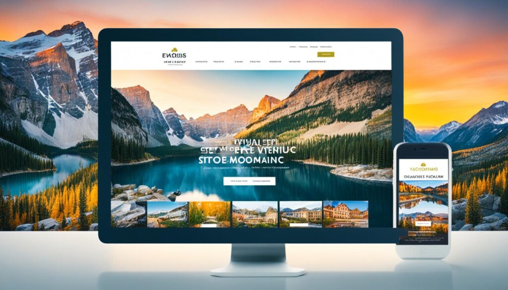
Image Placement: Before and After
| Before | After |
|---|---|
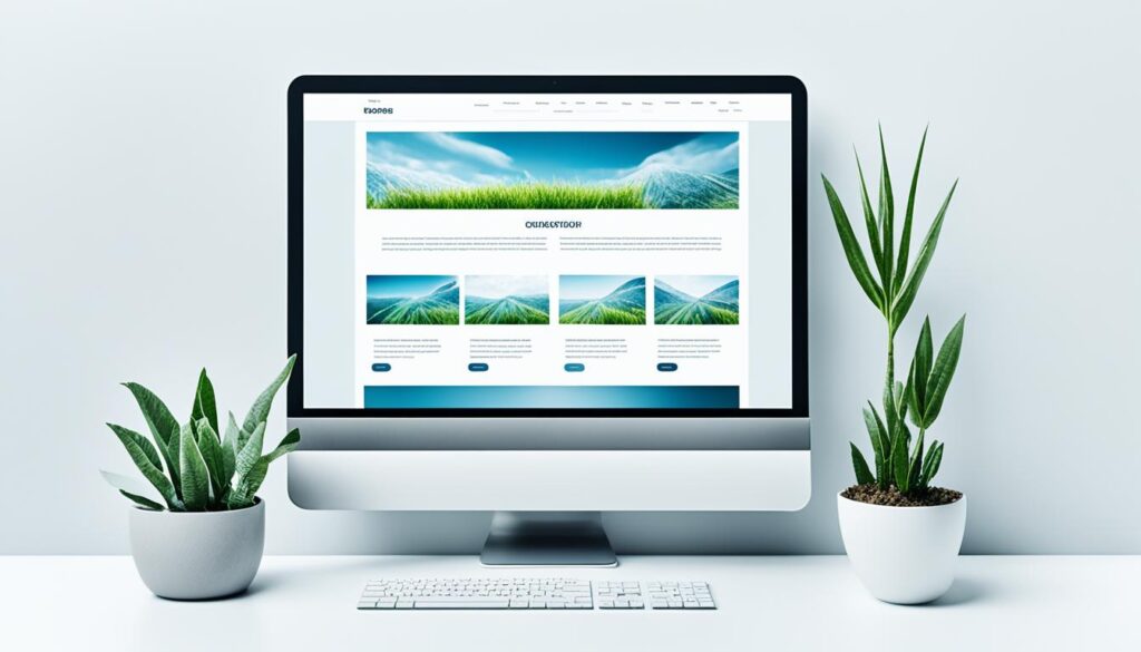 |
Lorem ipsum dolor sit amet, consectetur adipiscing elit, sed do eiusmod tempor incididunt ut labore et dolore magna aliqua. Ut enim ad minim veniam, quis nostrud exercitation ullamco laboris nisi ut aliquip ex ea commodo consequat. Duis aute irure dolor in reprehenderit in voluptate velit esse cillum dolore eu fugiat nulla pariatur. Excepteur sint occaecat cupidatat non proident, sunt in culpa qui officia deserunt mollit anim id est laborum. |
As you can see, placing the image within the content helps break up the text and provides a visual representation of the topic being discussed. This not only improves the visual appeal but also enhances the overall user experience by making the content more engaging and easier to consume.
Include Well-Designed and Written Headings
Headings are an important aspect of website design. They not only help users navigate through your content but also improve the searchability of your website. When creating headings, it’s crucial to ensure that they are well-designed and include relevant keywords to make it easier for visitors to find the information they are looking for.
Well-designed headings provide visual cues and structure to your content. They break up the text, making it more scannable and readable. This is especially important given the short attention span of online users.
When crafting headings, consider the following best practices:
- Use clear and concise language: Avoid using ambiguous or vague headings. Instead, use descriptive words that accurately represent the content of the section.
- Organize information hierarchically: Use headings to create a logical flow and structure within your content. This helps users understand the relationships between different sections and subtopics.
- Utilize appropriate HTML tags: Use header tags (such as
<h3>or<h4>) to differentiate between main headings and subheadings. This improves both readability and search engine optimization.
By incorporating these strategies, you can enhance the user experience on your website and improve search engine visibility. Well-designed and written headings make it easier for users to navigate and consume your content, leading to increased engagement and conversions.

Example of Effective Heading Design:
<h2> well-designed and written headings |
<h3> poorly formatted headings or lack of headings |
|---|---|
| Clear and concise language | Vague or ambiguous language |
| Organized hierarchically | Disorganized or no clear hierarchy |
| Proper use of HTML tags | Wrong or inconsistent use of HTML tags |
Optimizing UX Design for Mobile
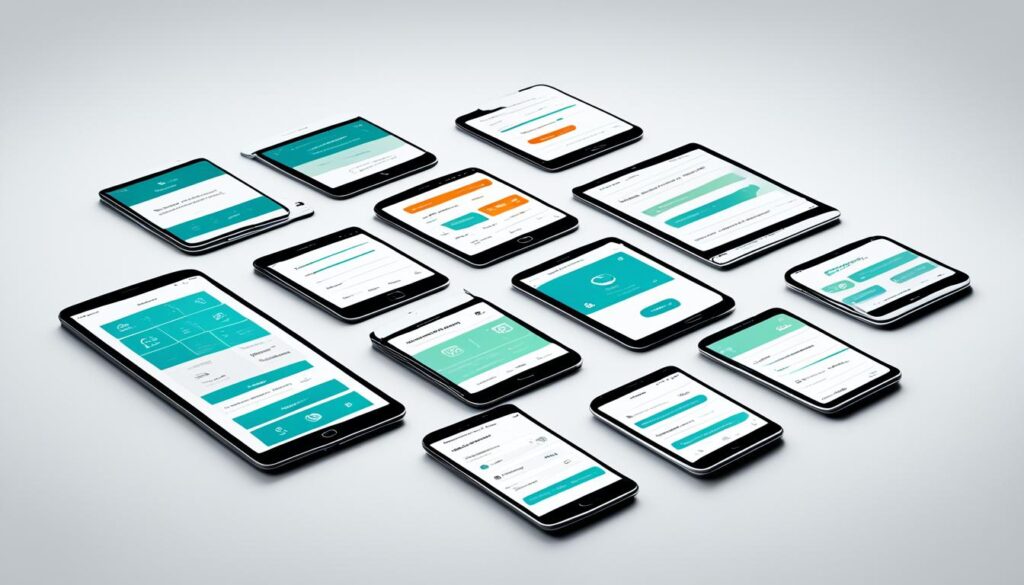
When it comes to providing a great user experience, optimizing your website for mobile is essential. With mobile devices accounting for a significant portion of web traffic, it’s crucial to ensure that your site is mobile-friendly and responsive.
Responsive design allows your website to adapt to different screen sizes, ensuring that it looks and functions seamlessly on smartphones and tablets. This means that users can easily navigate your site, read content, and interact with your call-to-action buttons, regardless of the device they are using.
Easy navigation is especially important on smaller screens, where limited space can make it challenging for users to find what they’re looking for. By organizing your navigation menu and prioritizing key content, you can make it easier for mobile users to explore your website.
Clear and easily accessible call-to-action buttons are essential for guiding users towards desired actions, such as making a purchase or filling out a contact form. By using contrasting colors and placing your buttons strategically, you can draw attention to them and encourage conversions.
Optimizing UX design for mobile goes beyond just the visual elements. It’s important to also consider factors such as page load speed and overall performance. Slow-loading pages can frustrate mobile users and lead to higher bounce rates. By compressing images and optimizing your code, you can improve page load times and ensure a smooth experience for your mobile visitors.
Remember, a mobile-friendly website is not only beneficial for your users but also for your search engine rankings. Google prioritizes mobile-friendly websites in search results, so optimizing your site for mobile can increase your visibility and drive more organic traffic.
By focusing on UX design and implementing responsive design principles, you can create a mobile-friendly website that delivers a seamless user experience on any device.
Next, let’s take a look at the importance of creating consistency in design and how it can enhance your website’s credibility and recognizability.
Key Points:
- Optimizing your website for mobile is crucial for providing a good user experience.
- Responsive design allows your site to adapt to different screen sizes and devices.
- Easy navigation and clear call-to-action buttons are important for mobile users.
- Page load speed and performance are key factors in mobile UX design.
- A mobile-friendly website can improve search engine rankings and drive more traffic.
Create Consistency in Design
Consistency in design is crucial for creating a coherent and visually pleasing website. By maintaining consistency in heading sizes, colors, fonts, buttons, and spacing, users can easily navigate your site and recognize your brand. Consistent design choices contribute to brand credibility and enhance recognizability among your target audience.
Ensuring that design elements make sense and remain consistent throughout the website allows users to have a seamless browsing experience. Whether they are navigating between pages or exploring different sections of your site, consistency in design creates a sense of familiarity and trust.
Consistency in Heading Sizes
Using consistent heading sizes throughout your website creates a visual hierarchy and helps users scan and understand the content more easily. Aim for a logical progression of heading sizes, with the main title being the largest and subsequent subheadings gradually decreasing in size.
Consistency in Colors
Using a consistent color palette reinforces your brand identity and adds visual cohesion to your website. Choose colors that align with your brand’s personality and style, and use them consistently across all elements, such as buttons, backgrounds, and text. This creates a harmonious visual experience and reinforces brand recognition.
Consistency in Fonts
Selecting a set of fonts and using them consistently throughout your website helps establish your brand’s visual identity. Choose fonts that are easy to read and convey the desired tone for your brand. Consistent typography creates a cohesive look and feel across your website, enhancing the overall user experience.
Consistency in Buttons
Buttons play a crucial role in guiding user interaction on your website. By maintaining consistency in button styles, colors, and placements, users can quickly understand how to navigate and take action. Consistent button design promotes familiarity, leading to increased user engagement and conversions.
Consistency in Spacing
Consistent spacing between elements, such as paragraphs, images, and sections, improves the overall visual balance of your website. Adequate spacing makes the content more scannable and enhances readability. It also creates a sense of professionalism and attention to detail, reinforcing brand credibility.
By creating consistency in design, you establish a strong visual identity, improve brand credibility, and enhance recognizability among your target audience. Users will appreciate the coherent and user-friendly experience, resulting in increased engagement and conversions.

UX Writing and Content Optimization
When it comes to delivering a user-oriented experience, UX writing plays a vital role. By using the right words and crafting content that is clear and concise, you can ensure that your users understand your message and navigate through your website effortlessly.
One key aspect of UX writing is to avoid using complex words and excessive jargon that might confuse your audience. Instead, opt for simple and easy-to-understand language that resonates with your users. This will not only enhance their comprehension but also improve their overall experience on your website.
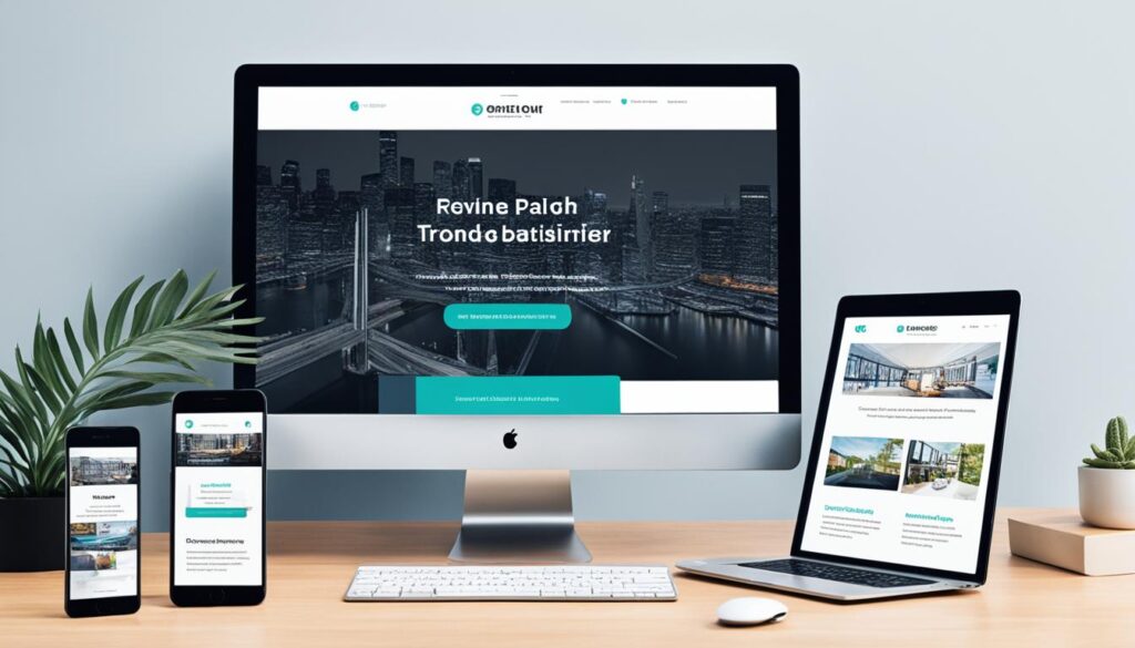
Combining well-written content with visual elements can significantly boost readability and engagement. Use visuals, such as images and infographics, to communicate information effectively and make your content more appealing. By striking the right balance between text and visuals, you can create a captivating user experience.
“Good UX writing helps bridge the gap between the user and the product, ensuring a seamless and enjoyable experience.”
In addition to clear and user-oriented writing, readability is another essential factor in optimizing content. Make sure to use appropriate headings, subheadings, and paragraphs to structure your text and break it into easily digestible chunks. This will facilitate scanning and enhance the overall readability of your content.
By prioritizing UX writing and content optimization, you can create user-oriented content that resonates with your audience. Remember, clear and concise language, combined with engaging visuals, enhances readability and improves the overall user experience on your website.
Conclusion
Improving the user experience of your website is crucial for the success of your digital marketing efforts. By implementing these website design tips, such as utilizing white space, optimizing page speed, using attractive calls to action, and creating consistency in design, you can significantly enhance the user experience and benefit your overall marketing strategy.
Firstly, by using white space effectively, you can create a clean and modern look that improves readability and draws attention to important content. Additionally, optimizing page speed ensures that users can access your site quickly and easily, minimizing bounce rates and increasing engagement.
Another important aspect is to use attractive calls to action that guide users towards desired actions. By employing action-oriented language and attention-grabbing colors, you can enhance website navigation and stimulate user engagement. Moreover, differentiating hyperlinks with underlined text and colored markers helps users identify clickable elements and enhances the overall user experience.
Furthermore, segmenting key information with bullet points improves content readability and enables users to quickly grasp important points. Using images wisely, particularly real and relevant visuals, can effectively convey your brand and create a connection with users. Additionally, including well-designed and keyword-rich headings improves searchability, while ensuring a mobile-friendly and responsive design optimizes UX for users accessing your site from smartphones and tablets.
Creating consistency in design, including color choices, fonts, buttons, and spacing, enhances brand credibility and recognizability. Lastly, optimizing content for readability through UX writing and combining it with visual elements further improves user engagement and overall user experience.
In conclusion, by following these website design tips, you can create a user-friendly website that not only improves user experience but also boosts your digital marketing efforts. Prioritize improved website design, and you’ll see the positive impact it has on user satisfaction, engagement, and conversions.
FAQ
What is white space in website design?
White space, also known as negative space, refers to the empty or blank space between elements in a website design. It helps create a clean and modern look and improves legibility and user attention.
How does page speed affect user experience?
Page speed is crucial for user experience as slow-loading pages can increase bounce rates. Optimizing website code and compressing images can significantly improve page load time and enhance the overall user experience.
How can attractive calls to action improve website navigation?
Clearly marked calls to action with action-oriented language and attention-grabbing colors can guide users towards desired actions, improving website navigation and increasing clicks and conversions.
Why is hyperlink differentiation important?
Differentiating hyperlinks with underlined text and different colors makes it clear to users that the text is clickable. This improves user navigation by providing visual cues that users recognize as links.
How do bullet points improve the readability of content?
Segmenting key information with bullet points allows users to quickly grasp important points and benefits. Bullet points enhance the attractiveness and readability of content, making it easier to understand.
How can including well-designed and written headings improve a website?
Well-designed and keyword-rich headings help guide users through a website and improve searchability. Search engines also give headings more weight, making optimized headings essential for improving a website’s visibility.
Why is mobile-friendliness important for user experience?
Mobile devices account for a significant portion of web traffic, so it’s crucial to optimize your website for mobile. Offering responsive design, easy navigation, and clear call-to-action buttons on smaller screens can provide a good user experience.
How does consistency in design benefit a website?
Consistent design choices, including heading sizes, colors, fonts, buttons, and spacing, create a coherent and visually pleasing website. Consistency improves brand credibility and recognition as users navigate between pages.
What role does UX writing play in improving user experience?
UX writing delivers clear and user-oriented content that enhances readability and engagement. By avoiding complex words and excessive terminology, and combining well-written content with visual elements, the user experience can be greatly improved.
How can I improve the user experience of my website?
Implementing these website design tips, such as utilizing white space, optimizing page speed, using attractive calls to action, and creating consistency in design, can significantly enhance the user experience and benefit your overall marketing strategy. Remember to prioritize mobile-friendliness, segment key information, and optimize your content for readability.
