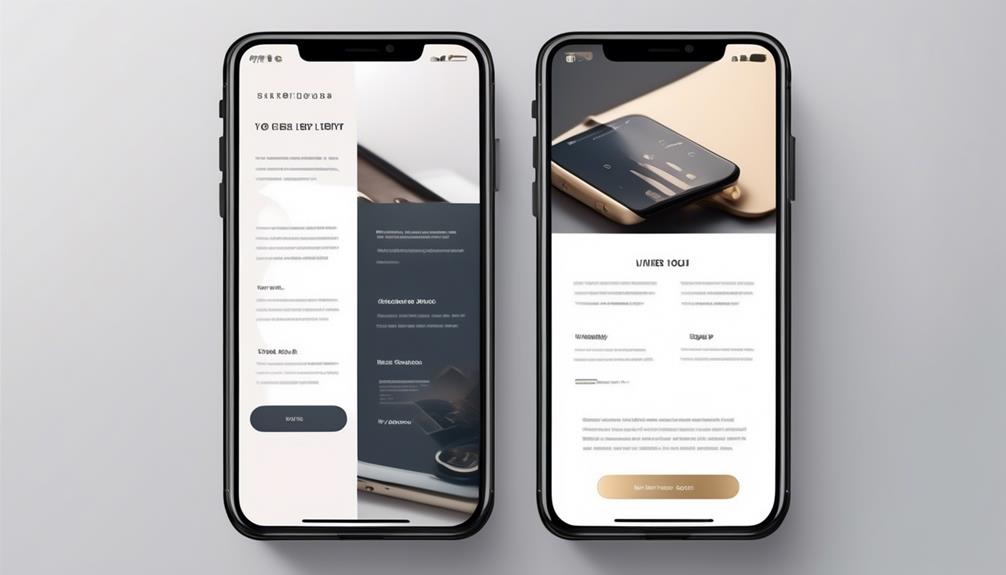
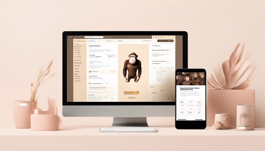
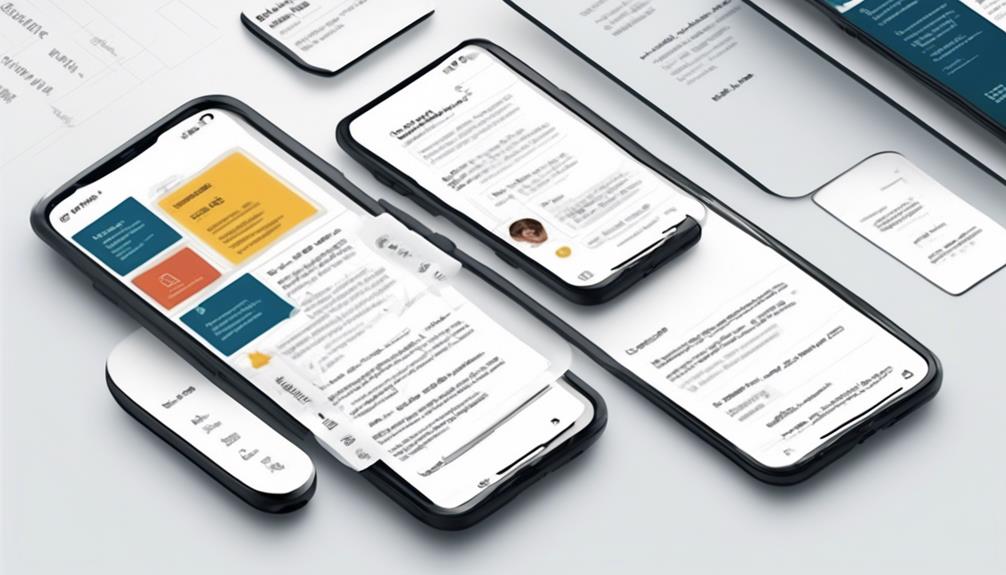
We have just implemented a responsive design strategy for our email campaigns, and the results have been impressive. In today’s digital world, it is crucial to have emails that work well on mobile devices. From ensuring a consistent user experience across all platforms to improving loading times, there are several important factors to keep in mind.
These strategies can significantly impact engagement and conversion rates. But what are the specific techniques that make emails more mobile-friendly? Join us as we explore seven key tips that will help you craft effective, user-friendly email designs that cater to the mobile audience.
Key Takeaways
- Pay attention to subject line length and craft clear and engaging pre-header text to optimize email open rates.
- Utilize responsive email templates and design mobile-friendly layouts to cater to the growing number of mobile users.
- Create concise and engaging content using short paragraphs, bulleted lists, and headers, ensuring it aligns with the email's purpose.
- Integrate images strategically with descriptive body copy, utilizing white space and responsive design for a visually appealing mobile email experience.

Elgato Prompter – Teleprompter with Built-in Screen for YouTube, Twitch, Zoom and More, 1080 pixels, Supports DSLR/Webcam/Smartphone, Drag & Drop Monitor Display, Works with Mac/PC & Stream Deck
Built-in display, Drag-and-drop: No extra tablets or smartphone screens required. Move any window or app onto Prompter’s display,...
As an affiliate, we earn on qualifying purchases.
Subject Line Length
Understanding the ideal subject line length is crucial for capturing mobile users' attention and maximizing email open rates. In today's world of email marketing, where mobile users constitute a significant portion of the audience, crafting subject lines that are concise and impactful is essential. Research indicates that subject lines should ideally be 41-50 characters long to ensure optimal visibility on mobile devices. Given that mobile devices typically display only 25-30 characters of a subject line, it's imperative to keep them succinct and to the point.
To enhance the mobile experience further, it's essential to utilize responsive email templates that adapt to various screen sizes, ensuring that the subject line remains prominent and engaging. Additionally, leveraging email reports to understand subscriber behavior and determine the best subject line length based on device usage can be highly beneficial.
Furthermore, paying extra attention to preheaders on mobile devices is crucial, as they're becoming more prominent and can support the subject line effectively.

Canon EOS R100 Mirrorless Camera RF-S18-45mm F4.5-6.3 is STM Lens Kit, 24.1 Megapixel CMOS (APS-C) Sensor, 4K Video, RF Mount, Black
Stellar Image Quality: Canon EOS R100 4K digital camera with 24.1 megapixel CMOS (APS-C) sensor for superb image...
As an affiliate, we earn on qualifying purchases.
Pre-Header Text

When it comes to email design, the pre-header text plays a crucial role in engaging mobile users. By ensuring a clear purpose for the pre-header, we can effectively capture recipients' attention and provide valuable information right at the beginning of the email.
Testing different pre-header lengths allows us to optimize user engagement and complement the subject line for maximum impact.
Clear Pre-Header Purpose
To maximize the impact of pre-header text in email campaigns, strategically craft clear and engaging content that complements the subject line and resonates with recipients. When designing mobile-friendly email campaigns, it's crucial to ensure that the pre-header text serves a clear purpose and enhances the overall user experience.
Here are key tips for creating a clear pre-header purpose:
- Tailor the pre-header text to align with the subject line and provide additional context.
- Test different lengths of pre-header text to optimize engagement across various devices and email clients.
- Use responsive templates to ensure the pre-header text displays effectively on mobile devices.
- Monitor subscriber behavior to understand how pre-header text influences email open rates and adjust strategies accordingly.
Crafting a clear pre-header purpose enhances the effectiveness of email campaigns and contributes to a positive user experience.
Engage Mobile Users
Crafting a clear pre-header purpose not only enhances the effectiveness of email campaigns but also plays a crucial role in engaging mobile users with compelling content.
With the increasing prevalence of mobile usage, creating mobile-friendly and responsive email designs is imperative. Mobile users have limited screen size, making it essential to captivate their attention quickly.
Utilizing pre-header text strategically can help in engaging mobile users by providing additional context and support to the subject line, ultimately enticing them to open the email.
Testing different pre-header text lengths based on subscriber behavior and device usage is crucial for understanding what resonates best with mobile users.

Torjim Softbox Photography Lighting Kit, 16'' x 16'' Professional Softbox Lighting Kit with 85W 3000-7500K LED Bulbs, Studio Lights for Photography/Video Recording/Live Streaming/Portraits Shooting
【Illuminate Your Creativity】 Torjim softbox lighting kit is made of high-quality PET fabric and a foldable nylon cover,...
As an affiliate, we earn on qualifying purchases.
Concise Copy
Utilize short, scannable, and easily digestible content to engage users efficiently and ensure your email remains comprehensible even without images. When crafting content for mobile devices, it's crucial to keep it concise and impactful. Here's how to achieve this:
- Bite-sized Content: Utilize short paragraphs, bulleted lists, and headers to present information in bite-sized, easy-to-digest chunks. This approach enhances readability on mobile devices and keeps the audience engaged.
- Font Size and Formatting: Use a responsive template and consider the font size and formatting to ensure that the content is easily readable on various devices. Large blocks of text can be overwhelming on mobile screens, so opt for a clear and legible font size.
- Engaging Copy: Craft compelling copy that conveys the message effectively, even in the absence of images. Your content should be powerful enough to stand alone and prompt action from the reader.
- Clarity and Relevance: Ensure that the content is relevant, clear, and aligned with the email's purpose. Avoid unnecessary information and focus on delivering value in a concise manner.

Geimrsy i2/12-inch professional teleprompter, tempered optical glass, all-metal structure, equipped with remote control and dedicated app, compatible with a wide range of devices
Teleprompter adopts the design of liftable structure, according to the different devices and shooting needs to flexibly adjust...
As an affiliate, we earn on qualifying purchases.
Thoughtful Images
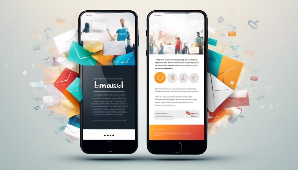
Keeping our focus on enhancing the mobile email experience, we now turn our attention to the pivotal role of thoughtful images in creating engaging and impactful content. In mobile email design, thoughtful images play a crucial role in capturing the audience's attention and conveying the message effectively.
It's essential to make strategic use of white space and responsive design to ensure that images are displayed appropriately on various devices. When incorporating images into customer service emails or marketing communications, it's important to consider the 'images off' experience. This involves providing descriptive body copy that complements the images and ensures that the email makes sense even when images are blocked.
Thoughtful images should be used to enhance the surrounding text and not as a standalone element. By carefully integrating images with the body copy, emails can deliver a cohesive and impactful message.
Ultimately, the goal is to create a visually appealing and engaging mobile email experience that resonates with the audience.
Clear CTAs
We prioritize the clarity and prominence of the call-to-action (CTA) to ensure it stands out and prompts immediate action from the reader. When it comes to mobile-friendly email design, clear CTAs are essential for driving engagement.
Here are some best practices for creating effective CTAs in your emails:
- Clearly state the desired action: Use concise and compelling language to communicate exactly what action you want the recipient to take. Whether it's 'Shop Now,' 'Learn More,' or 'Sign Up,' clarity is key.
- Prominently place the CTA: Position your call-to-action near the top of the email to ensure it's one of the first elements the recipient sees. This helps grab the attention of busy, on-the-go readers quickly.
- Optimize CTA button size: Make sure your CTA buttons are at least 44 x 44 pixels to enhance clickability, especially on mobile devices. The larger size makes it easier for users to tap the CTA without accidentally clicking on other elements.
- Use effective examples: Look to industry leaders like Freshbooks for inspiration on how to effectively design and position CTAs in mobile-responsive emails. Learning from successful implementations can guide your own CTA strategies.
Breathing Room
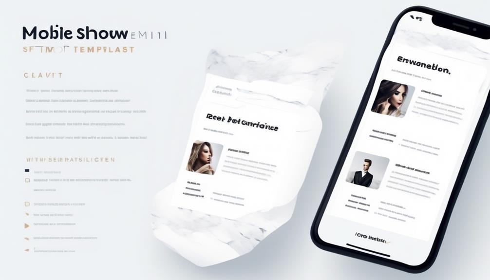
When it comes to mobile-friendly email design, the concept of breathing room is crucial.
By allowing sufficient space around links and CTAs, we enhance clickability and prevent accidental clicks.
This ensures a seamless user experience and contributes to making emails more click-friendly for mobile readers.
Spacing for Readability
Implementing generous spacing around elements is essential for enhancing readability and creating a visually pleasing design in mobile-friendly email layouts. To optimize spacing for readability in mobile email design, follow these key tips:
- Utilize white space around links: Ensure that links are surrounded by enough white space to make them easily clickable without accidentally tapping on other elements.
- Make your content scannable: Break up your content into short paragraphs and use bullet points or numbered lists to make your emails easier to read and comprehend on mobile devices.
- Keep in mind the font size: Use a minimum font size of 14pt for body text and 22pt for headlines to ensure easy reading on mobile devices.
- Optimize for different conditions: Ensure strong contrast between text and background colors for improved readability, considering different mobile device settings and conditions.
Clear Visual Hierarchy
Strategically incorporating ample white space in mobile-friendly email designs creates a clear visual hierarchy and enhances readability. By using white space effectively, we can separate different elements and contribute to a clean, minimalist design. This breathing room not only enhances visual appeal but also improves the overall user experience. Leaving space around links and call-to-action buttons makes the email more click-friendly, reducing accidental clicks and frustration for the reader. To ensure a clear hierarchy of information, it's advisable to use a single-column layout for mobile-friendly emails. This seamless user experience is essential for readers accessing the mobile version of emails on various email clients. The table below summarizes the key points for creating a clear visual hierarchy in mobile-friendly email designs.
| Key Points | Benefits | Considerations |
|---|---|---|
| Ample white space | Clear visual hierarchy, enhanced readability | Strategic placement of elements |
| Breathing room around links | Improved click-friendly design, reduced accidental clicks | CTA visibility, user experience |
| Single-column layout | Clear hierarchy of information, seamless user experience | Adaptability for different devices |
Minimalistic Design Approach
To maintain a clean visual hierarchy and enhance readability in mobile-friendly email designs, a minimalistic approach with ample white space is essential. When creating emails, make sure your templates incorporate this minimalistic design approach to optimize email opens on various devices.
Here's how to achieve this:
- Strategic Placement: Position elements thoughtfully to avoid clutter and make it easier for recipients to scan and comprehend the email content.
- Ample White Space: Ensure that there's enough white space around different elements to enhance the user experience and contribute to a modern, minimalist email design.
- Enhanced Visual Appeal: Utilize white space to provide breathing room, improving the overall visual appeal of your emails and landing pages.
- Modern Look: Use a minimalistic approach to design, separating different elements and creating a clean, modern appearance.
Multi-Device Testing

Testing your emails across multiple devices is essential to ensure a consistent display and functionality for all recipients. We want our emails to look great and make it easy for subscribers to navigate through the email on a mobile phone. Multi-device testing is crucial for delivering a seamless experience across different devices.
By investing time in testing, we can provide a consistent experience for our subscribers. Using tools like Campaign Monitor to test in over 25 email clients can help us avoid rendering issues and ensure our email looks as intended before sending, thus preventing compatibility problems. This proactive approach can save us from potential headaches and ensure that our subscribers receive an optimized viewing experience, regardless of the device they use.
Making sure that our emails are thoroughly tested across various devices will make my email stand out and leave a positive impression on our subscribers, ultimately contributing to the success of our email marketing efforts.
Are the Key Tips for Mobile-Friendly Email Design the Same as the Top Tips for Mobile-Friendly Email Design?
When it comes to creating engaging content, the key tips for mobile-friendly email design play a crucial role in capturing the audience’s attention. From using responsive design to optimizing images, following the top tips for mobile-friendly email design can significantly improve the user experience and drive better results for your email campaigns.
Frequently Asked Questions
How Do I Make an Email Template Mobile Friendly?
We make email templates mobile friendly by:
- Using concise subject lines.
- Incorporating pre-header text.
- Keeping email copy short and scannable.
- Planning for 'images off' experiences.
- Placing clear and easily clickable call-to-action buttons near the top of the email.
This ensures our emails are engaging and easy to read on mobile devices.
What Is an Appropriate Layout for an Email Being Optimized for Mobile?
We should use a single-column layout for mobile-optimized emails. This ensures better readability and avoids issues like overlapping content.
Adding ample white space enhances visual appeal and readability. Font size should be 2-3 points larger than for desktop emails.
Optimize call-to-action buttons for easy tapping. Curate subject lines and preheaders within 30 characters.
Consider challenges like varied email client displays and images being turned off by default. This will make our templates more mobile-friendly for a better user experience.
How Do You Design Mobile Friendly?
We always focus on designing mobile-friendly emails by prioritizing responsiveness and user experience.
Our approach involves optimizing subject lines for limited character displays, utilizing pre-header text for additional context, keeping the copy concise and scannable, planning for an 'images off' experience, and strategically placing CTAs for maximum clickability.
What Size Should Email Design Be for Mobile?
We should design email for mobile to be between 320-550 pixels wide. This ensures it fits various screen sizes.
It's important to use single-column layouts for better visibility on mobile devices and to employ responsive design techniques to adapt to different screen sizes.
Additionally, optimizing images for faster loading and testing across multiple devices and email clients are crucial for proper formatting and compatibility.
Conclusion
In conclusion, designing mobile-friendly emails is like building a sturdy bridge across different devices.
By prioritizing content, using responsive design, and optimizing load times, we create a smooth pathway for our subscribers to navigate.
Just like a well-constructed bridge ensures a safe and efficient journey, mobile-friendly email design ensures a positive user experience, leading to higher engagement and satisfaction.
Let's keep building strong bridges for our subscribers to connect with our content.
