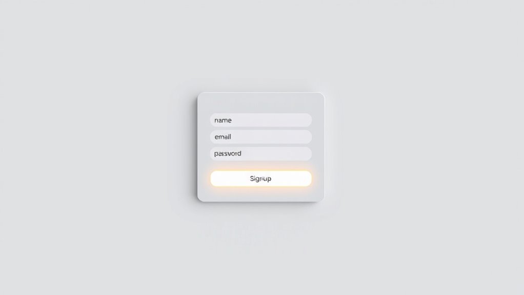
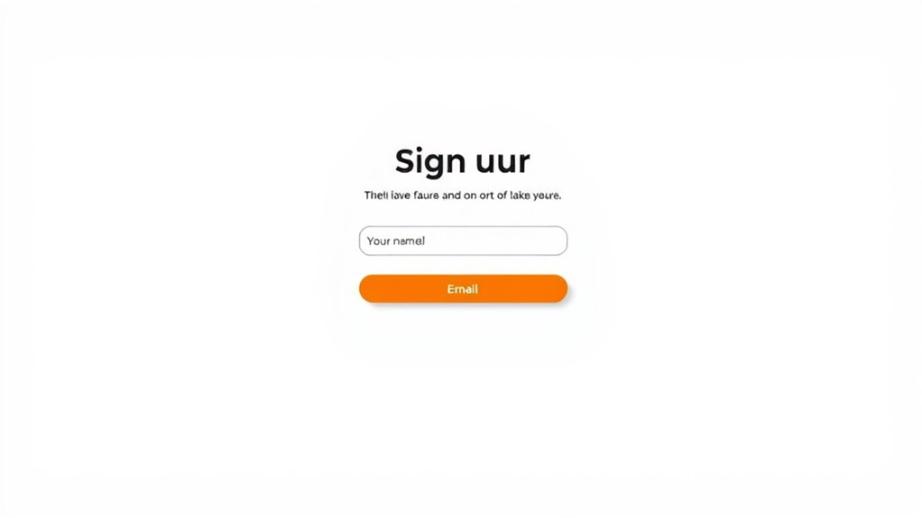
To create high-converting signup forms, place them above the fold or strategically after engaging content like benefits or testimonials, making them easy to find without scrolling excessively. Use minimal, clearly labeled fields—such as name and email—to reduce friction, and incorporate real-time validation to prevent errors. Design bold, colorful buttons with action-oriented text positioned prominently. Continuing this guide will help you refine these elements further, boosting your sign-up success rates effectively.
Key Takeaways
- Position signup forms above the fold for immediate visibility and strategic placement after benefits or testimonials.
- Keep form fields minimal, asking only for essential information like name and email to reduce friction.
- Use clear, action-oriented call-to-action buttons with contrasting colors to attract attention and encourage clicks.
- Incorporate relevant content around the form to reinforce value without causing distraction.
- Ensure the form layout is clean, focused, and easy to navigate with logical field order and real-time validation.

A well-optimized signup form can substantially boost your conversion rates and grow your user base. One of the key elements to focus on is button design, which directly influences whether visitors take action. Your signup button should stand out without clashing with the overall design, guiding users seamlessly toward completing the form. Using color psychology, you can select hues that evoke the right emotions and motivate users to click. For example, bright colors like green or orange often create a sense of urgency or positivity, encouraging immediate action. Conversely, softer tones like blue can foster trust and reassurance, making users feel comfortable sharing their information. The shape and size of your button also matter; a larger, well-placed button signals importance and makes clicking easier, especially on mobile devices. Clear, concise text on the button, such as “Sign Up” or “Join Now,” reinforces the action you want users to take. Avoid vague phrases and opt for direct, compelling language that leaves no doubt about what happens next.
Placement of your signup form plays an *essential* role in maximizing conversions. Position it where visitors naturally look and expect to find it—preferably above the fold, so users don’t have to scroll to see it. If your page contains compelling content, consider repeating the form at strategic points, like after explaining benefits or showcasing testimonials. This keeps the signup option accessible without interrupting the user experience. Additionally, avoid clutter around the form; a clean, focused layout directs attention to the fields and the call-to-action button. You want to minimize distractions and make the process as straightforward as possible. Incorporating content relevance can also improve user engagement and increase the likelihood of signups. The fields included in your signup form should be carefully selected to strike a balance between gathering enough information and reducing friction for the user. Only ask for essential details, such as name and email address, especially if you’re aiming for quick signups. The more fields you add, the higher the chances users will abandon the process. You can gather additional data later through follow-up emails or surveys. Use logical order and clear labels to guide users effortlessly through the form. If you include optional fields, mark them clearly so users aren’t overwhelmed or deterred from completing the form. Also, consider real-time validation to immediately notify users of errors, preventing frustration and increasing the likelihood of successful signups.

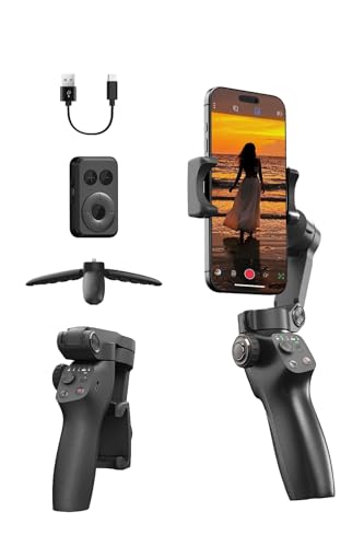
hohem iSteady X3 SE Gimbal Stabilizer for iPhone, Phone Stabilizer with Detachable Remote Control, Portable Foldable 3-Axis Phone Gimbal for Android & iPhone 16 15 Pro Max, Ideal for Travel Vlogging
Detachable Remote Controller: The hohem iSteady X3 SE Gimbal comes with a detachable magnetic remote, allowing you to...
As an affiliate, we earn on qualifying purchases.
Frequently Asked Questions
How Do I Test My Signup Form’s Effectiveness?
You can test your signup form’s effectiveness by conducting A/B testing, where you compare different versions to see which performs best. Pay attention to user feedback to identify pain points or confusion. Track key metrics like conversion rates and bounce rates. Keep experimenting with variations in placement, fields, and design, then analyze the results to optimize your form for maximum signups.
What Are Common Mistakes to Avoid in Form Design?
Think of your signup form as a welcoming path; avoid cluttered design or confusing signals. Guarantee button placement feels natural, so users easily click without searching. Clear field labeling guides them smoothly, like signs on a trail. Don’t cram too many fields—keep it simple. Missing these details can cause users to hesitate or abandon, so focus on intuitive button placement and straightforward labels to boost conversions and create a seamless experience.
How Can I Track Form Conversion Rates?
You can track your form conversion rates by implementing analytics tools like Google Analytics or dedicated conversion tracking software. Use A/B testing to compare different form versions and see which performs best, while analyzing user behavior to identify drop-off points. This approach helps you understand what encourages signups and optimize your form accordingly, ultimately increasing your conversion rates and achieving your goals more efficiently.
What Are Best Practices for Mobile Signup Forms?
Ever wonder how to make your mobile signup forms irresistible? Focus on mobile responsiveness and a thumb-friendly design. Use large, easily tappable buttons and minimal fields to streamline the process. Keep forms simple, avoid clutter, and guarantee fast loading times. By prioritizing these best practices, you’ll boost conversions and create a seamless experience that encourages users to sign up effortlessly on any device.
How Do I Personalize Forms for Different Audiences?
You personalize forms for different audiences by using audience segmentation to identify key groups. Then, incorporate dynamic content that adapts form fields, headlines, and offers based on each segment’s preferences or behavior. This tailored approach increases relevance and engagement, making users more likely to complete the form. Test different variations for each audience segment to optimize performance and make your personalization efforts truly resonate.

DJI Osmo Mobile 7P Gimbal Stabilizer for iPhone, Android, Native Tracking, Lighting, 3-Axis Phone Gimbal, Quick Launch, One-Tap Edit, Built-in Extension Rod & Tripod, 10hrs Use, Phone Charging
Snap the Spectacular - The Multifunctional Module packs intelligent tracking, DJI Mic 2/DJI Mic Mini reception, and lighting...
As an affiliate, we earn on qualifying purchases.
Conclusion
Remember, a well-placed form with the right fields can make all the difference. While complex forms might seem thorough, simplicity often wins more signups. It’s tempting to ask for everything upfront, but valuable offers and strategic placement can do the heavy lifting. So, don’t just fill your forms with questions—fill them with purpose. Ultimately, a clean design and smart placement turn visitors into loyal subscribers, proving less truly is more.

Drone with EIS 4K Camera for Adults, GPS Drone with 5.0" Screen on Controller, 70 Mins Flight, Long Range Transmission, AI Track&Orbit Mode, Follow Me, Auto Return, Lightweight and Foldable RC Drones for Beginner Toy Gifts, Under 249g
【Drone with Screen on Controller】Instant FPV with 5.0” Display – No Phone Needed: Experience truly immersive flying with...
As an affiliate, we earn on qualifying purchases.

FUNSNAP CM8 Gimbal Stabilizer for iPhone Android, 3-Axis Phone Gimbal with Remote Control Portable Foldable, Phone Stabilizer for Video Recording for Tiktok YouTube Vlog
[Powerful Gimbal Stabilizer for Smartphones] Featuring improved 3-axis stabilization, this phone gimbal guarantees stable and shake-free footage, even...
As an affiliate, we earn on qualifying purchases.


